OUR COLOURS TAKE INSPIRATION FROM NATURE
© James Morgan / WWF-US
The WWF colour system takes its inspiration from colours in the natural world around us.
OUR PRINCIPAL COLOURS ARE BLACK & WHITE
OUR PRINCIPAL COLOURS ARE BLACK & WHITE
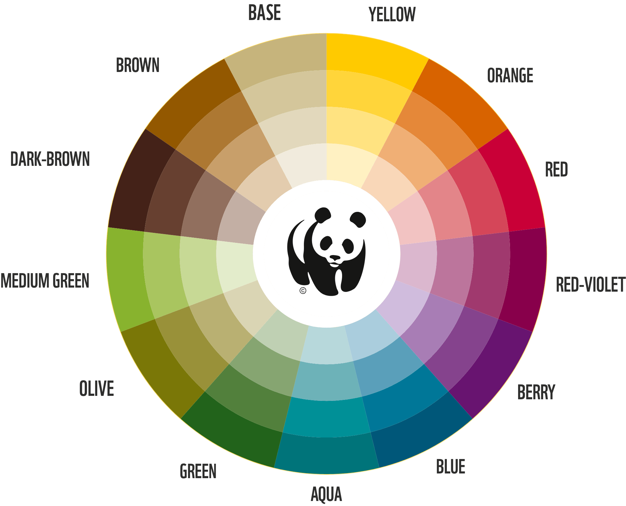
THE SECONDARY COLOUR PALETTE
These swatches show our new secondary colour palette (visible on this page as hex values). Our secondary colours should be combined and contrasted rather than used all together. They provide a spectrum of options to be used in various ways in combination with our principal brand colours of black and white.
YELLOW
PANTONE™: 7404 U
CMYK: 0 10 100 5
RGB: 245 210 0
HEX: f5d200
CMYK: 0 10 100 5
RGB: 245 210 0
HEX: f5d200
ORANGE
PANTONE™: 144 U
CMYK: 0 60 100 0
RGB: 245 210 0
HEX: f07d00
CMYK: 0 60 100 0
RGB: 245 210 0
HEX: f07d00
RED
PANTONE™: 200 U
CMYK: 10 100 60 0
RGB: 218 29 82
HEX: da1d52
CMYK: 10 100 60 0
RGB: 218 29 82
HEX: da1d52
RED-VIOLET
PANTONE™: 228 U
CMYK: 10 100 0 35
RGB: 154 0 100
HEX: 9a0064
CMYK: 10 100 0 35
RGB: 154 0 100
HEX: 9a0064
BERRY
PANTONE™: 2607 U
CMYK: 60 100 0 0
RGB: 129 41 144
HEX: 812990
CMYK: 60 100 0 0
RGB: 129 41 144
HEX: 812990
BLUE
PANTONE™: 315 U
CMYK: 100 0 10 45
RGB: 0 114 143
HEX: 00728f
CMYK: 100 0 10 45
RGB: 0 114 143
HEX: 00728f
AQUA
PANTONE™: 329 U
CMYK: 100 0 40 20
RGB: 0 145 145
HEX: 009191
CMYK: 100 0 40 20
RGB: 0 145 145
HEX: 009191
GREEN
PANTONE™: 357 U
CMYK: 80 0 100 40
RGB: 0 121 50
HEX: 007932
CMYK: 80 0 100 40
RGB: 0 121 50
HEX: 007932
OLIVE
PANTONE™: 378 U
CMYK: 40 20 100 30
RGB: 123 132 39
HEX: 7b8427
CMYK: 40 20 100 30
RGB: 123 132 39
HEX: 7b8427
MEDIUM GREEN
PANTONE™: 376 U
CMYK: 50 0 100 0
RGB: 140 198 63
HEX: 8cc63f
CMYK: 50 0 100 0
RGB: 140 198 63
HEX: 8cc63f
DARK-BROWN
PANTONE™: 440 U
CMYK: 70 90 100 30
RGB: 85 47 37
HEX: 552f25
CMYK: 70 90 100 30
RGB: 85 47 37
HEX: 552f25
BROWN
PANTONE™: 1545 U
CMYK: 20 50 100 30
RGB: 154 104 28
HEX: 9a681c
CMYK: 20 50 100 30
RGB: 154 104 28
HEX: 9a681c
BASE
PANTONE™: 5855 U
CMYK: 25 20 50 0
RGB: 196 188 142
HEX: c4bc8e
CMYK: 25 20 50 0
RGB: 196 188 142
HEX: c4bc8e
USING TINTS
We suggest using full-strength swatches wherever possible, but usage of tints are accepted within the brand. When using tints, use percentage tints, or similar, within your chosen program.
USING COLOUR
BLACK AND WHITE
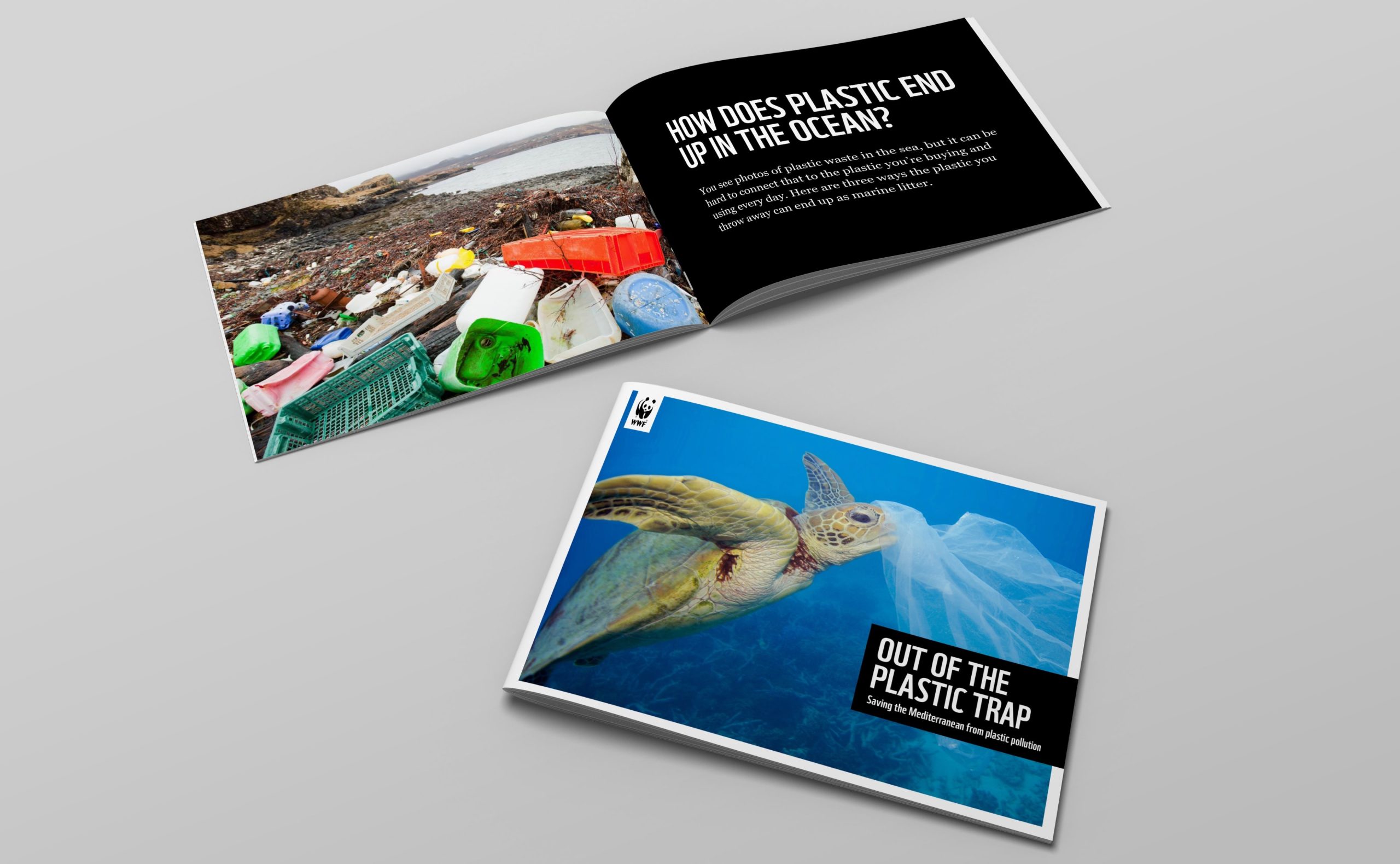
Black and white is our principal colour palette. This should form the basis of your design. For example, title boxes and other WWF brand elements should be black and white. Colour should be used as highlights, navigation elements, and pull-out features.
ADDING SECONDARY COLOURS
A full-strength colour must be used. For example, you cannot have a layout that uses black, white and a single tint.
The secondary colour must be relevant to the subject. Avoid using more than two colours from the secondary palette in a single layout. Any tint may also be used when a full strength colour has been used.


USING SECONDARY COLOURS
As the secondary colour palette is based on colours from nature, you should always be able to select a colour that complements the image.
In this example, the use of colour is used as a highlight and complements the layout.
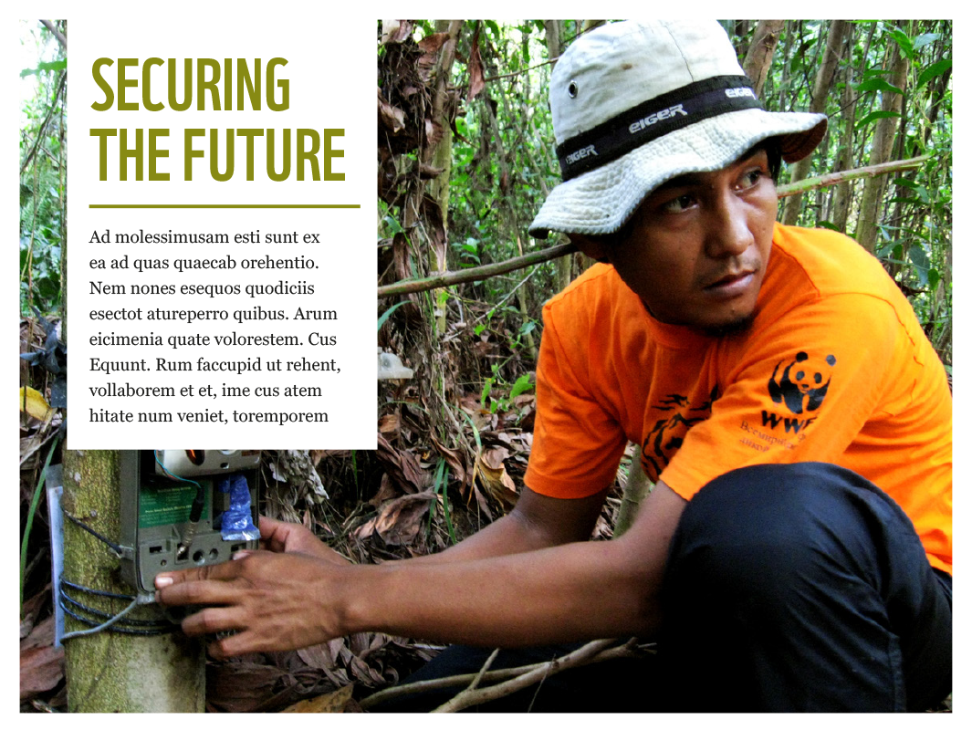
© WWF-indonesia / Tiger Survey Team
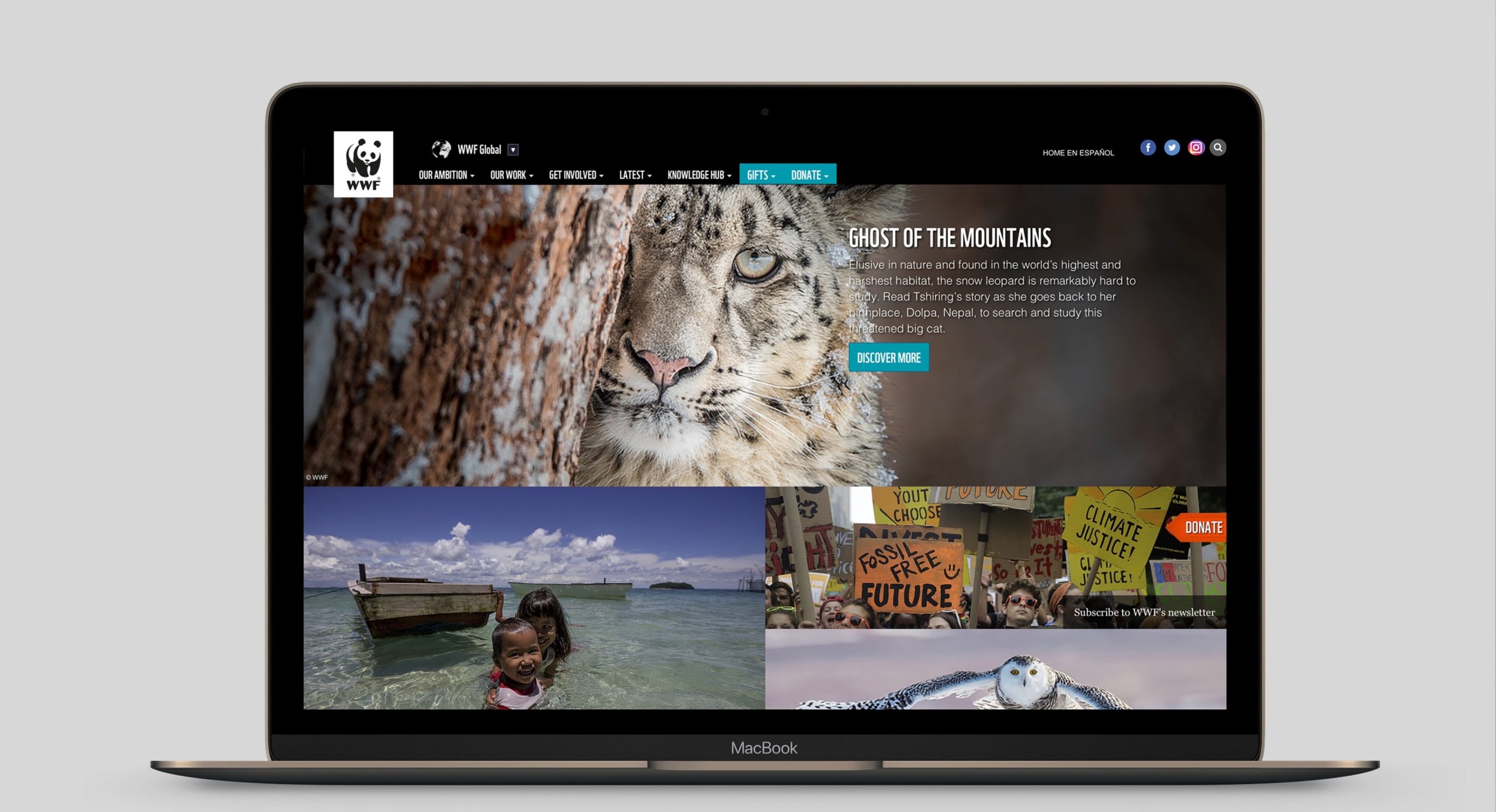
In this example, the secondary colour palette has been used to highlight navigational elements.
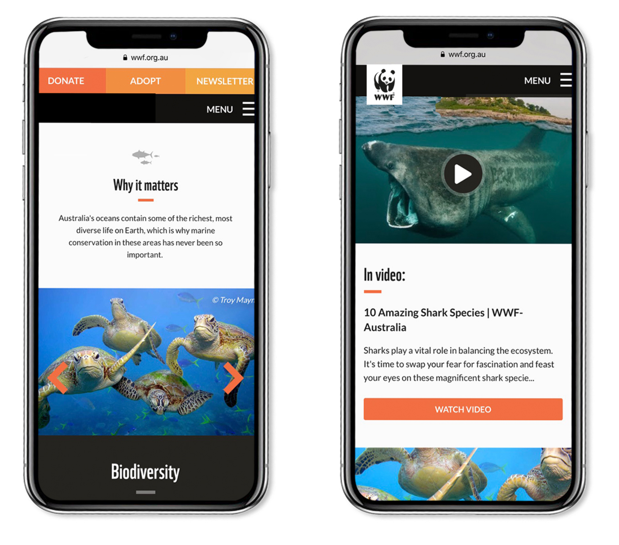
In this example, the secondary colour palette has been used to highlight navigational elements and to highlight key information.
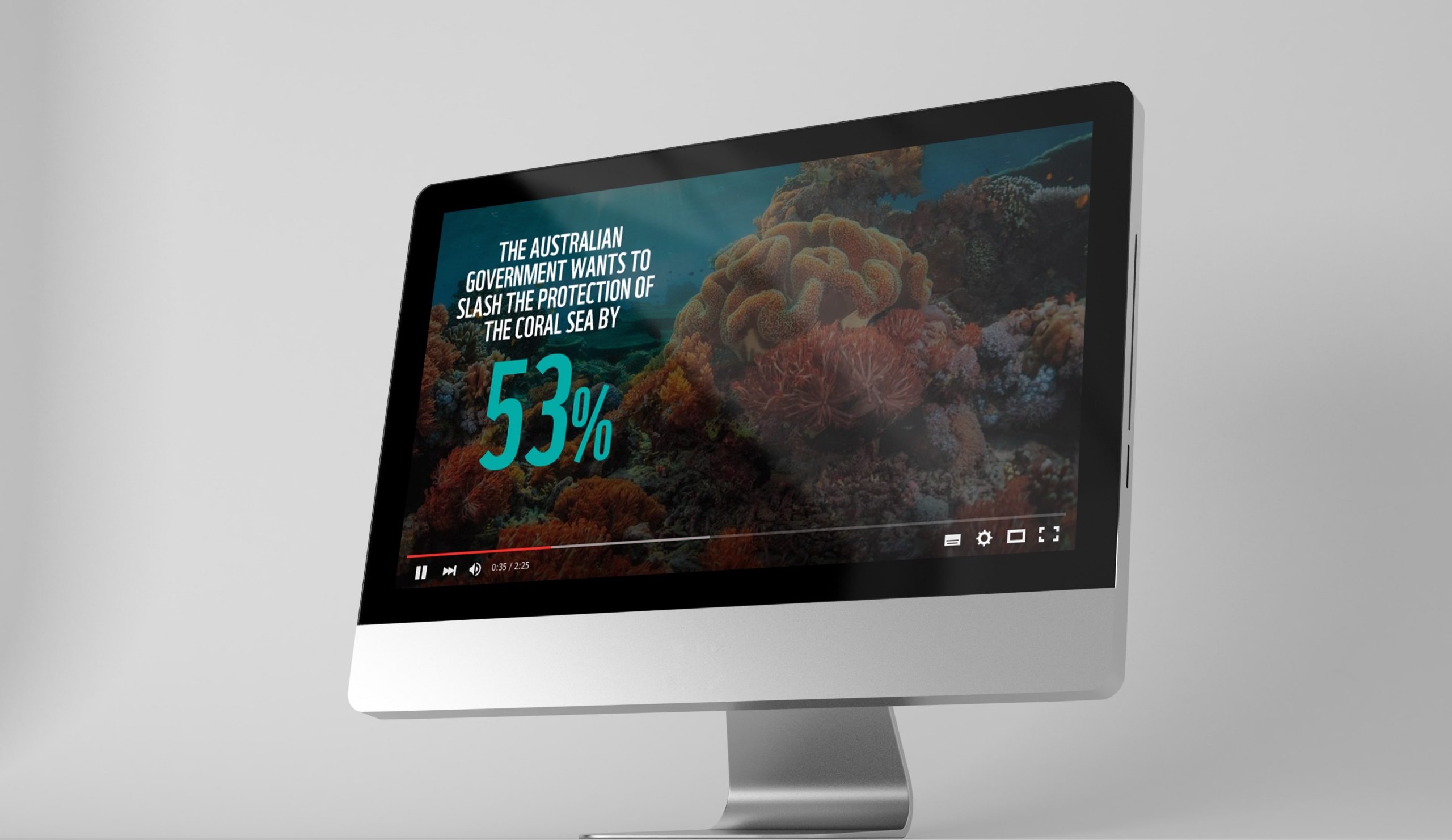
In this example, a colour from the secondary colour palette (Aqua) has been used to highlight a key number.