INFOGRAPHICS

© Adam Oswell / WWF-Thailand

Infographics – icons, maps and charts – bring topics to life and engage with audiences in an immediate and understandable way.

© WWF-Brazil / Adriano Gambarini

We are a science-based organization, but we must also ensure that technical information is pitched at the right level for each audience and, when relevant, be ready to engage with people emotionally as well as intellectually. To help ensure our science-led approach is given appropriate emphasis and enables our audiences to understand and engage with it, we have developed a signature style for portraying scientific information in a more visual way.

The clear and distinctive style of these graphics creates brand recognition, strengthening and uniting our visual communications. They can be used alongside photography or help lift a page when photography is not appropriate or necessary.

ICON STYLE

Icons bring a subject, statement, story or fact to life. As a fact-based organization, we want our illustration to represent reality as much as possible. This is why we recommend:
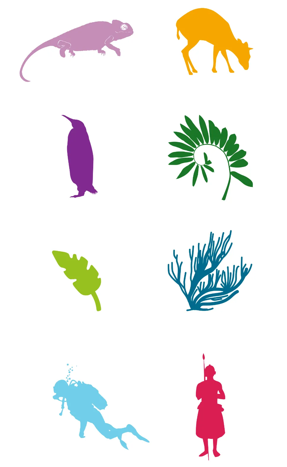
  • Using realistic representations of the element we want to portray;
  • Making sure we use recognizable silhouettes so they are clear and can be relevant in many contexts;
  • Using monochrome icons, to keep our design simple and clear. When using several icons, you can also use different tones of the same colour and different levels of transparency.
We have a library of existing icons to use, which can be downloaded below.
Our infographics are made from vector images from public domain sources, available for commercial public use and modification under the creative common zero licence.

USING THE ICONS

Icons can be used across different communications materials: from youth-oriented magazines to scientific papers.
  • Always be mindful of audiences when using icons, and make sure they are consistent and aligned with the content and tone of your piece.
  • Use colours from the secondary colour palette and layout to create the tone of the piece, always within the limits of the brand guidelines.
©WWF, Living Planet Report 2020

USING THE ICONS WITH TYPE

We recommend combining the icons with words and key numbers for a more impactful and complete communication. Make sure you state the source of your content.
We recommend using our iconic WWF font, but other fonts are also available. Visit the typography page for more information.

CREATING NEW ICONS AND USING STOCK ICONS

© Anthony B. Rath / WWF
If you need to create new icons, we recommend using images from the Hive or make sure the image rights are cleared. Choose a simple and clear image where the silhouette is easily recognizable.
Although you may have a good image, this may not translate well as an icon. The style should be detailed and clear. The example below is difficult to see and also lacks detail and definition.
© naturepl.com / Steven Kazlowski / WWF
In addition to our existing library, icons from other sources can be used with the help of stock image sites, such as Shutterstock, iStock or Vexels. Many realistic silhouette images representing people and nature are available.
Always download vector images, and make sure you select or modify icons according to the infographics guidelines. Make sure rights are cleared and state your sources.

ICON DO’S AND DON’T’S

Use realistic, recognizable and monochrome silhouettes.

You can combine icons with words and key numbers to provide more in-depth information for audiences.

Do not use “outlined” icons. Always use solid colours.

Do not use multiple colours or colours not in our palette. Do not mix and match styles or colours within a single layout. Also, be mindful of perspective and sizes. Unless for specific youth audiences, do not use cartoony or unrealistic icons.

BEST PRACTICE EXAMPLES

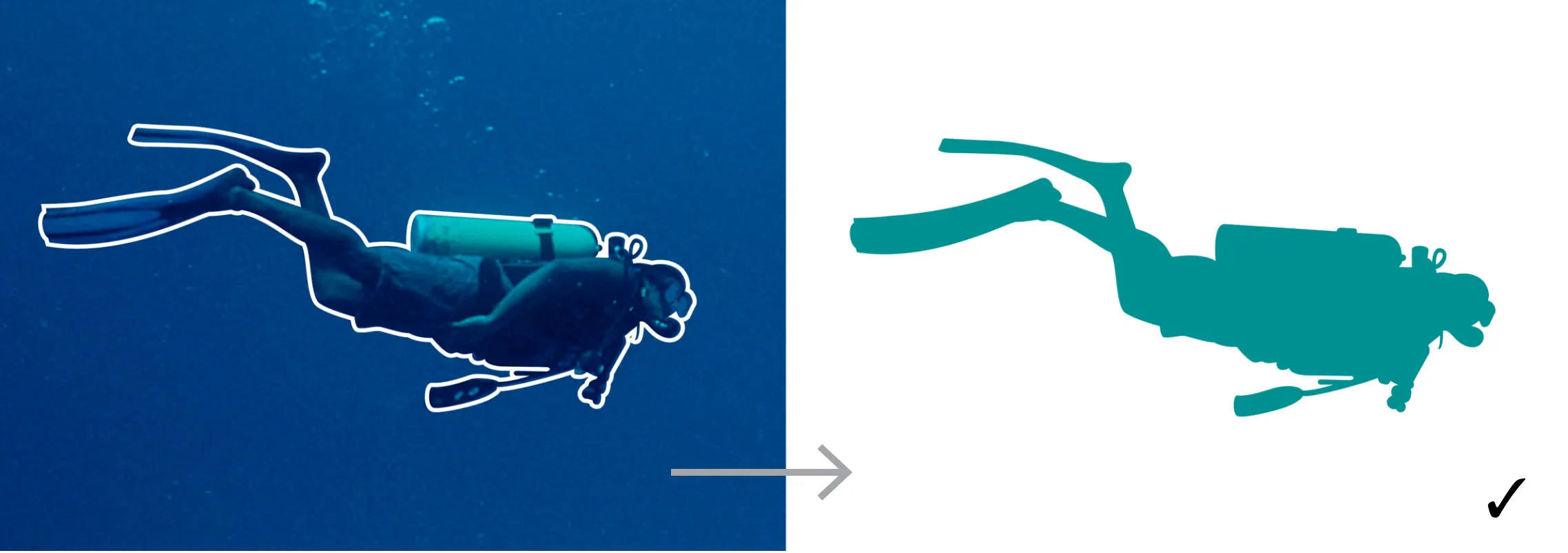
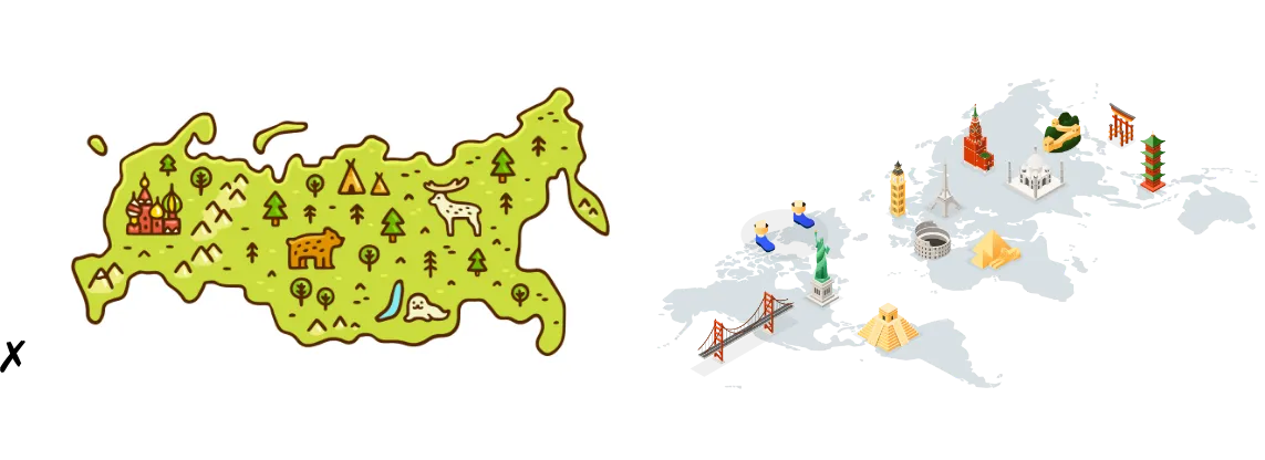
This example shows how the silhouettes can be used in a fun and bold way that would appeal to children and other mass audiences.

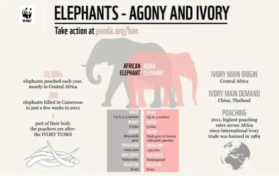
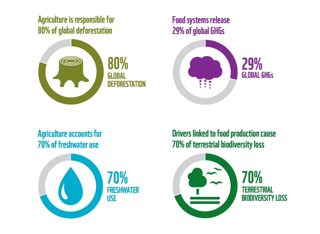
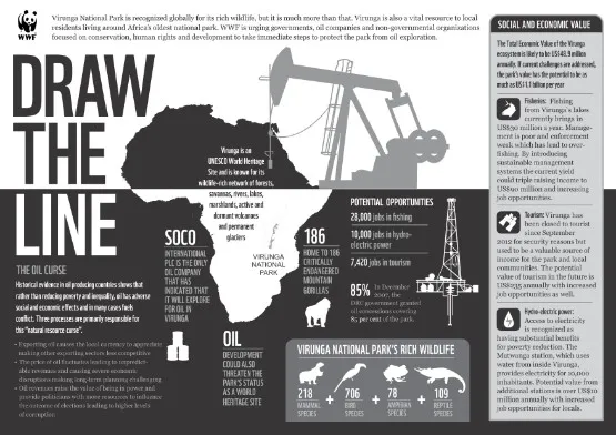
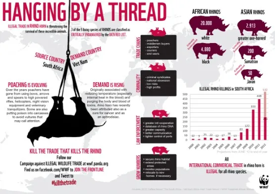
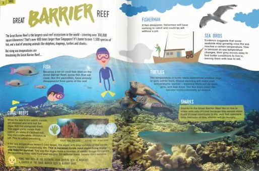
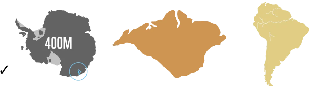
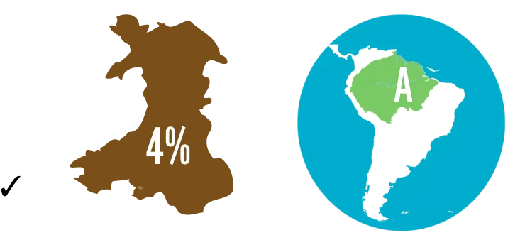
This example shows how the silhouettes can be used to illustrate data and scientific evidence.

This example uses icons to highlight key information and create an illustrative layout.
This example uses a simple colour scheme to add interest and highlight information.

USING ILLUSTRATIONS

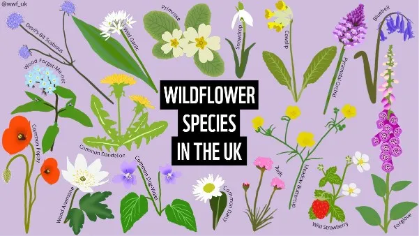
Illustration example by WWF-UK.

For specific audiences and campaigns, you may wish to use illustrations. When using a bespoke style, you must ensure that the illustrations are audience-focused and consistent. Do not mix and match styles within a single layout.

Panda Junior magazine by WWF-Singapore.

You must also ensure that illustration styles are of a high standard, and fit well with the high-quality outputs we normally expect as an organization.
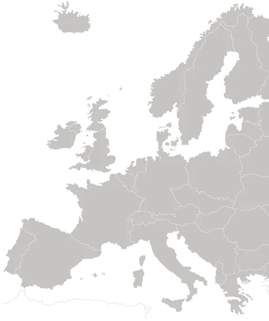
MAPS

© James Morgan / WWF-US

Maps can make stories more relevant and help readers to understand their geographical context. They make issues or stories more understandable, while adding value to the document. You can use maps as main images, as illustrations with accompanying text in the margins, and as a background to facts and other illustrations.

MAP STYLE

The same rules we have established for icons apply to maps.
  • Make sure we use realistic, solid colour, silhouette-style maps.
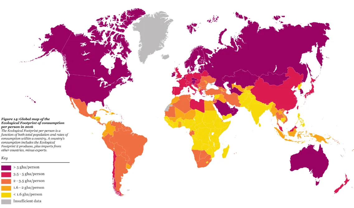
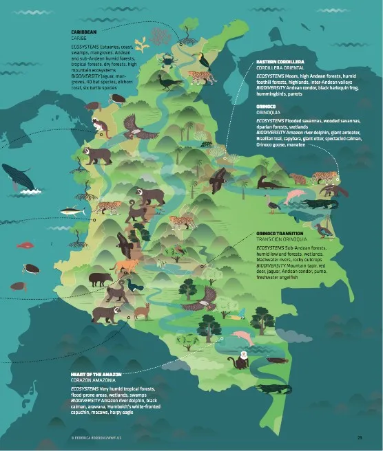
  • Add copy and data to the maps to create fully informational diagrams.
Additional vector maps can be found from other sources such as Shutterstock, iStock or Vexels.
Make sure you select and use maps according to our guidelines.
A selection of maps is available and can be downloaded here.

USING MAPS

When used to support text in a particular communication, maps are often coloured grey with a highlight colour (see our secondary colour palette) for highlighted information.
As a global civil society organization, we should not comment on geopolitical issues unless directly and specifically related to conservation matters. To remain neutral, we use UN guidelines for politically sensitive country names and geographical regions; and, for areas where control could be a matter of dispute between states, avoid using maps that represent the territorial claims of either party (e.g. avoid representing borders).
If this is not possible, we recommend adding the following disclaimer:
The designation of geographical entities and the presentation of the material, do not imply the expression of any opinion whatsoever on the part of WWF concerning the legal status of any country, territory, or area, or of its authorities, or concerning the delimitation of its frontiers or boundaries.
To provide additional information alongside maps, such as map legends, keys, labels, source information and text, we recommend using our WWF font for short bold headings and other fonts such as Open Sans for additional messages. Visit the typography page for more information.

CREATING UNIQUE MAPS

In some cases, and for specific audiences, you may wish to use creative map styles. This would be classed as an illustration and not have to necessarily stick to the infographic style. When using a bespoke style, you must ensure that the illustrations are audience-focused and consistent.
Do not mix and match styles within a single layout and ensure that illustration styles are of a high standard and fit well with the high-quality outputs we normally expect as an organization.

MAP DO’S AND DON’T’S

Use realistic, monochrome maps – or with a single colour scheme – in solid colours, from the secondary colour palette.
Combine with text, key numbers, legends and sources if necessary, to provide clear and complete information for your audience.

Do not use maps that are difficult to read or overly stylized.
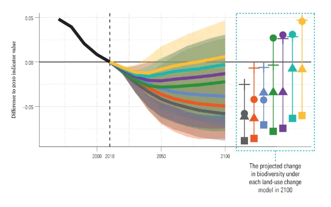
Unless for specific audiences, do not use overly cartoony or 3D maps for infographics.

CHARTS

© Diego Pérez / WWF Peru
Charts can often bring complicated information to life in a much more understandable way. You can create on-brand charts and graphs directly with the traditional programs such as Microsoft Office or Google suite. More complex graphs may need to be drawn with the help of more specialized programs such as Illustrator.

CHART STYLE

The same rules we have established for icons and maps apply to charts.
  • To remain clear and simple, we recommend using flat, solid coloured graphics.
  • Avoid multiple colours or effects.
  • Make sure you add a clear legend and reference your source if needed.
© WWF, Living Planet Report 2020

USING CHARTS

Charts are used to display more complex information, to compare and demonstrate trends, patterns and relationships.
Information such as type, keys and legends, captions or sources should use our WWF font for short bold headings and other fonts, such as Open Sans for additional categories such as legends. Visit the typography page for more information.
Feel free to combine charts and icons for a more impactful communication.

CREATING UNIQUE CHARTS

Sourced from worldwildlife.org/stories/make-or-break-year-ahead-for-south-africa-s-rhinos
You can create unique charts in an illustrative style by combining them with icons and other information.
Sourced from twitter.com/wwf_australia/status/1215151294777896965
Do not mix and match styles within a single layout and ensure that illustration styles are of a high standard and fit well with the high-quality outputs we normally expect as an organization.

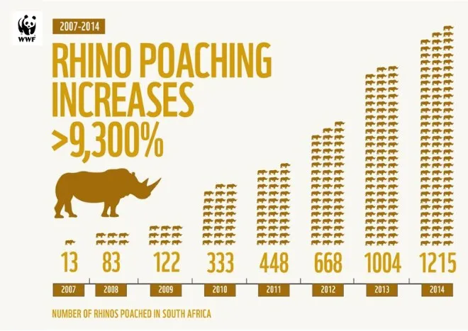
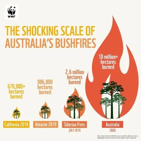
CHART DO’S AND DON’T’S

©WWF, Living Planet Report 2020
Use flat graphics, with a single colour scheme. You can combine charts and icons for a more impactful communication.
Sourced from Leclère et al. (2020)
Add a clear legend and state your sources.

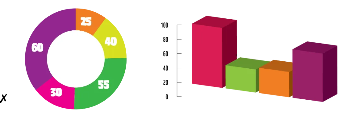
Do not use colours or typefaces outside of our brand identity. Do not use 3D or any other effects.