OUR LOGO IS ONE OF THE MOST POWERFUL SYMBOLS ON THE PLANET
© Bernard De Wetter / WWF
Our iconic logo is at the heart of all our communications – and is recognized all over the world.
Logo
What is the story behind WWF’s panda logo? The inspiration for our logo came from Chi-Chi: a giant panda that arrived at London Zoo in 1961 – the same year that WWF was created.
Aware of the need for a recognisable symbol that would overcome all language barriers, WWF’s founders agreed that Chi-Chi’s distinctive shape and colour would make a great logo. The first sketches were made by the British environmentalist and artist, Gerald Watterson.
Based on these, Sir Peter Scott, one of our founders, drew the first logo. He said at the time that “we wanted an animal that is beautiful, endangered, and loved by many people in the world for its appealing qualities. We also wanted an animal that had an impact in black and white to save money on printing costs.”
The panda has since become a symbol not just for WWF but also for the conservation movement as a whole.
The panda has since become a symbol not just for WWF but also for the conservation movement as a whole.
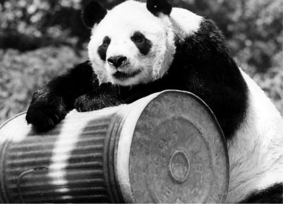
Chi-Chi, the inspiration for the WWF logo. Image courtesy of BBC.
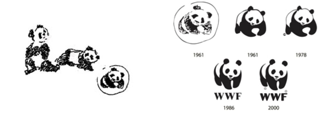
British environmentalist and artist Gerald Watterson played a key role in the original panda logo by producing the initial sketches.
THE WWF LOGO
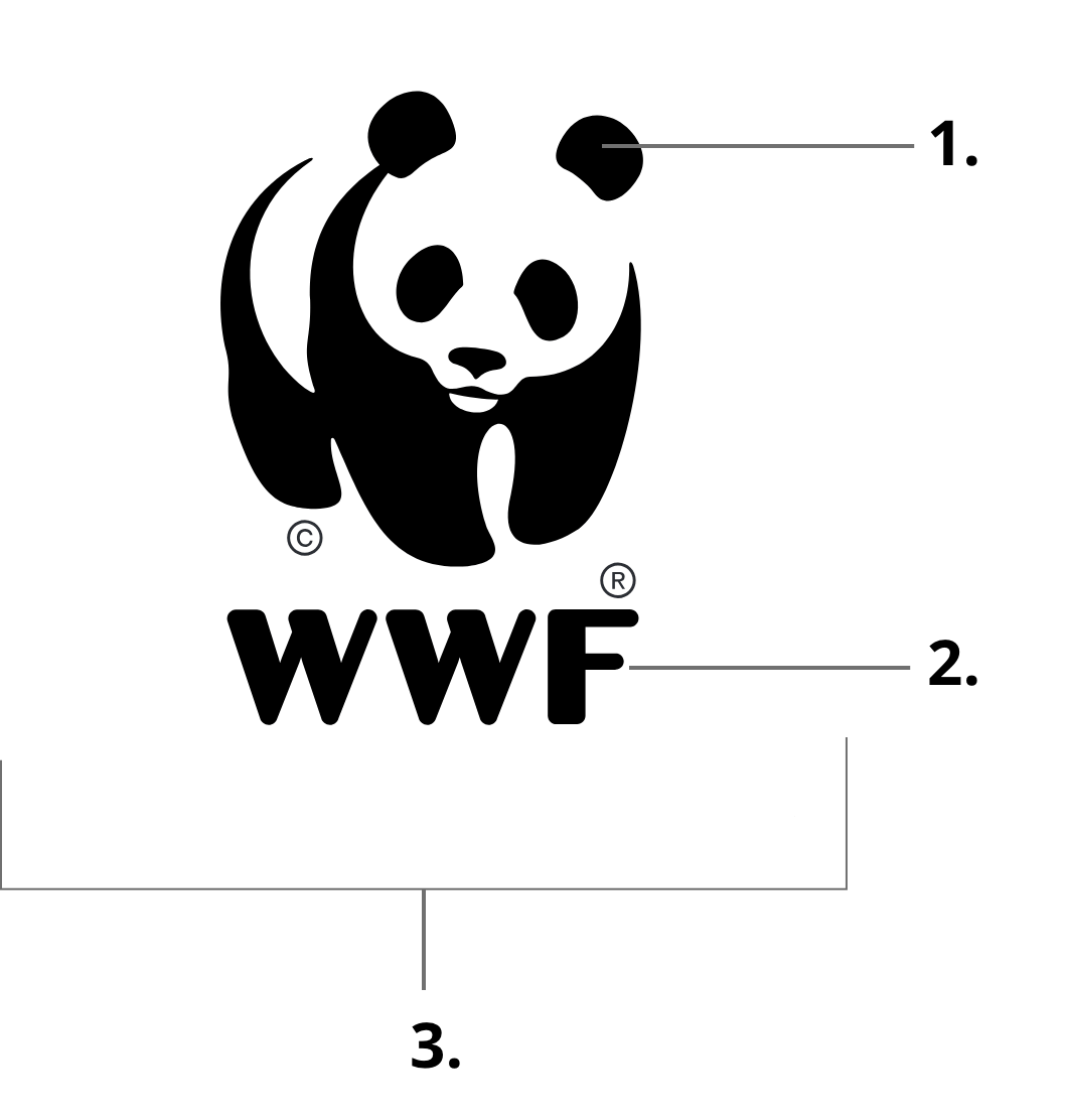
The ‘WWF Logo’ can never be altered or modified. It is made up of three inseparable elements:
- The panda icon
- The WWF initials
- The containment shape
When we refer to the WWF Logo, we are referring to all three locked-up elements.
- The WWF Logo cannot be used without its white containment shape.
- The WWF initials design cannot be used outside of the logo.
The panda icon can be used outside of the logo, please consult the guidelines for more information. - The copyright and registered trademark symbols must always appear on the logo.
Please contact commsmarketing@wwfint.org for specific requests such as a transparent logo file for merchandising.
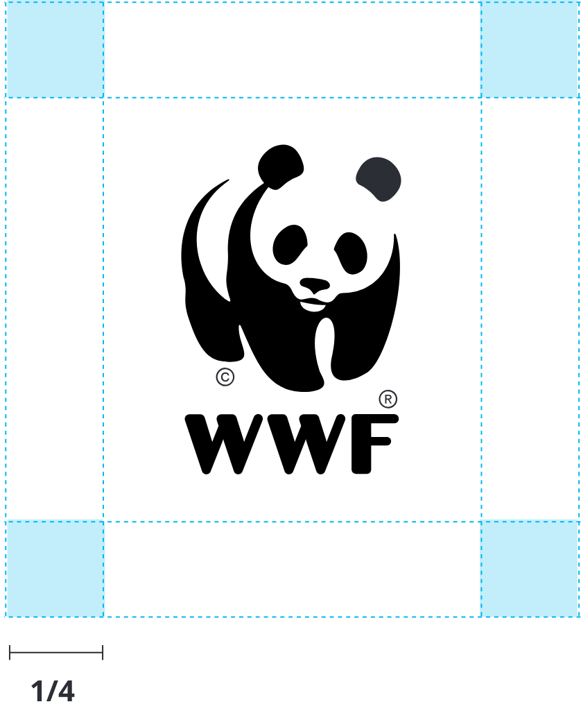
CLEARANCE SPACE
The clearance space around the WWF Logo is 1/4 of the width of the whole box. This space is not required at the edge of the page or screen.
However, the WWF Logo can be placed onto background images. In this instance, please consider the positioning or your image and avoid overly busy backgrounds within the clearance space.
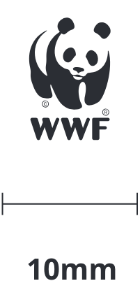
MINIMUM SIZE
The containment shape has a minimum width of 10mm for print.
Digital executions do not have a minimum size as favicons and avatars are determined by the platform.
LOGO DON’TS

Do not remove the white containment shape of the logo. There is no transparent version of the logo.

Do not add a keyline
to the logo.
to the logo.

Do not decrease or modify the size of the white containment shape.

Do not distort the logo.

Do not change the colour
of the logo.
of the logo.

Do not reverse
out the logo.
out the logo.
USING THE LOGO
© WWF-Indonesia / Samsul Komar
REGISTERED TRADEMARK AND COPYRIGHT STATEMENT
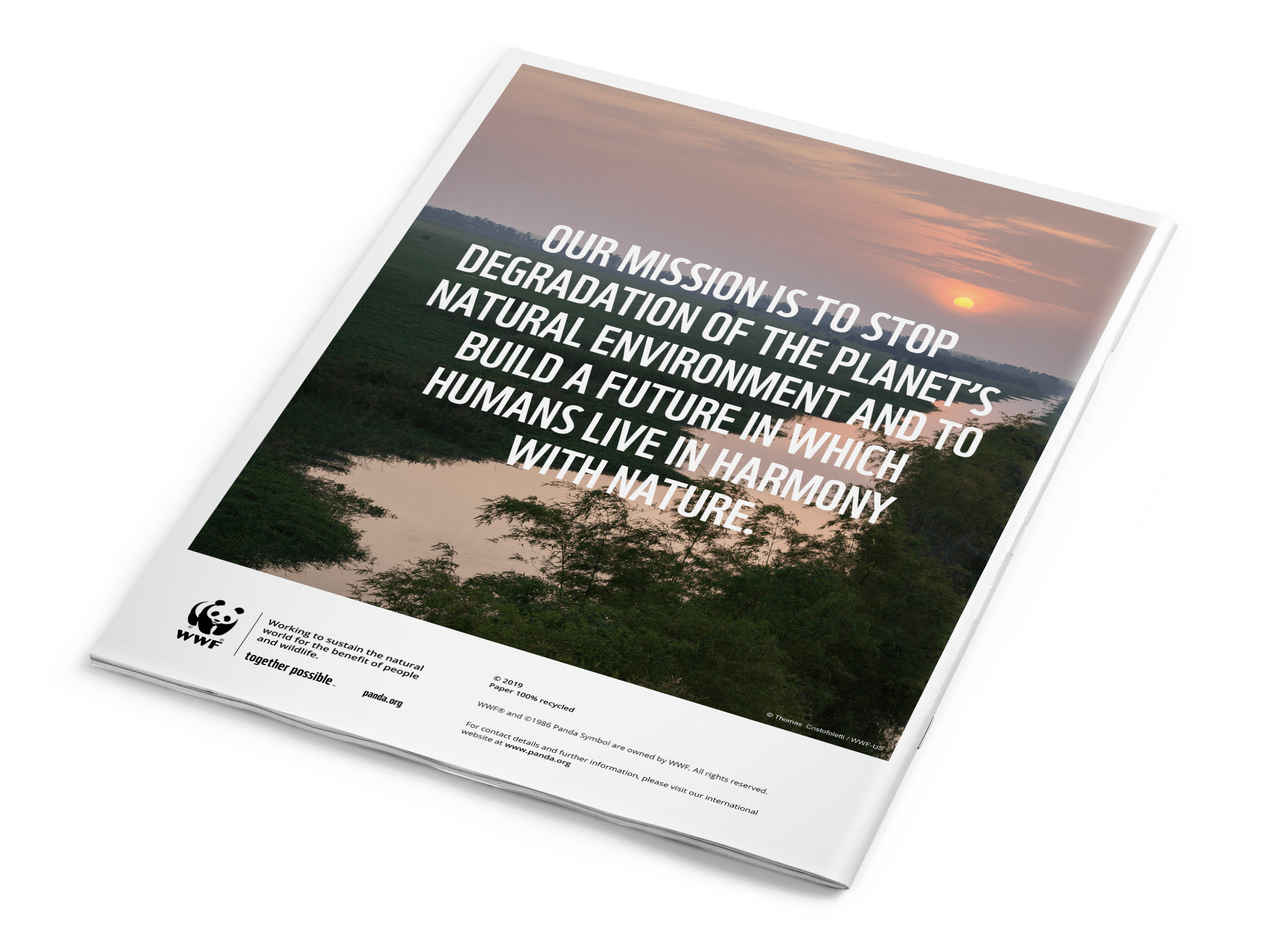
Any reference to WWF, or use of the WWF logo in a publication, website or promotional item will need to be accompanied by a registration mark ® and copyright symbol ©.
Please state at the bottom or back of piece:
WWF® and ©1986 Panda Symbol are owned by WWF. All rights reserved.
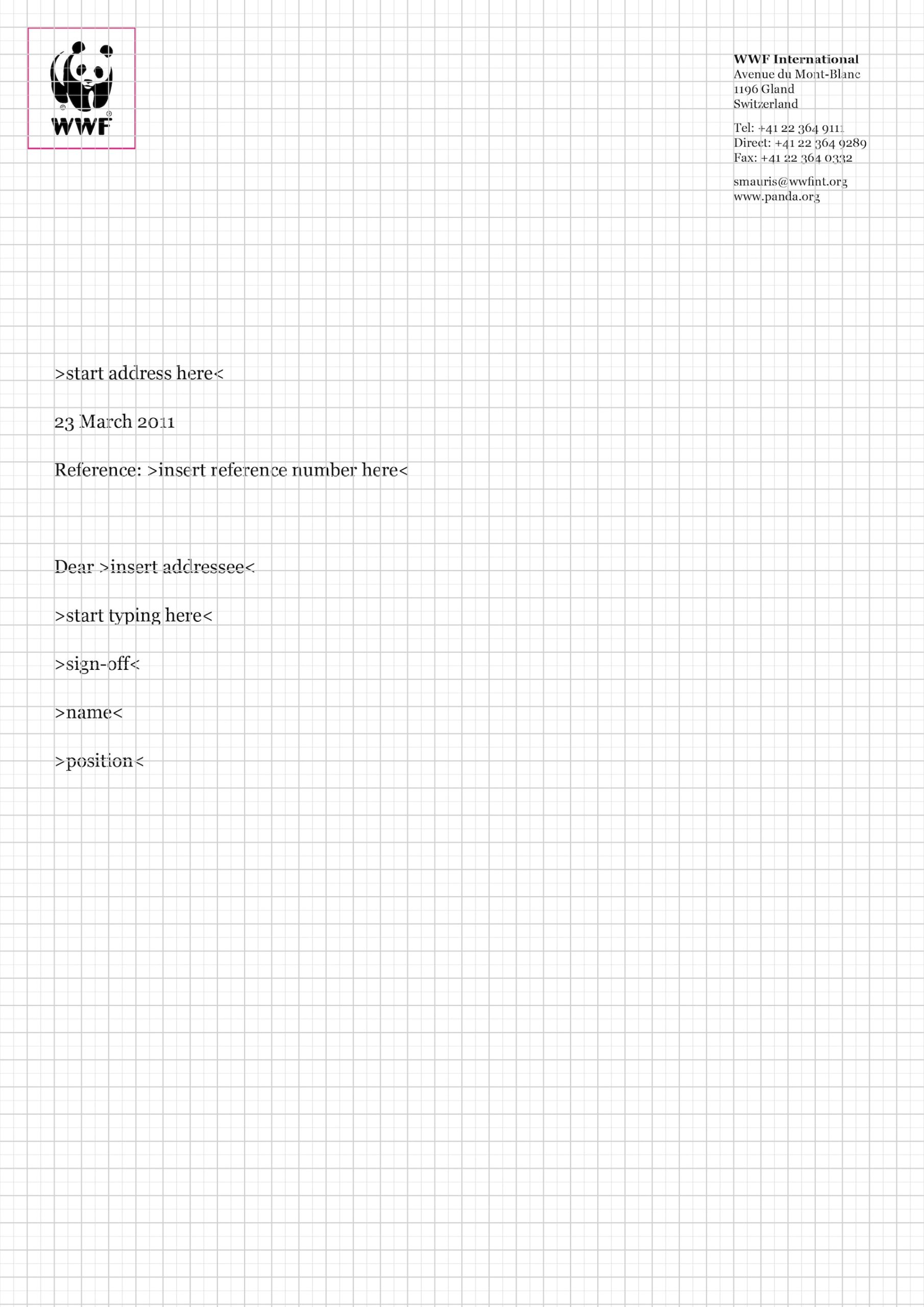
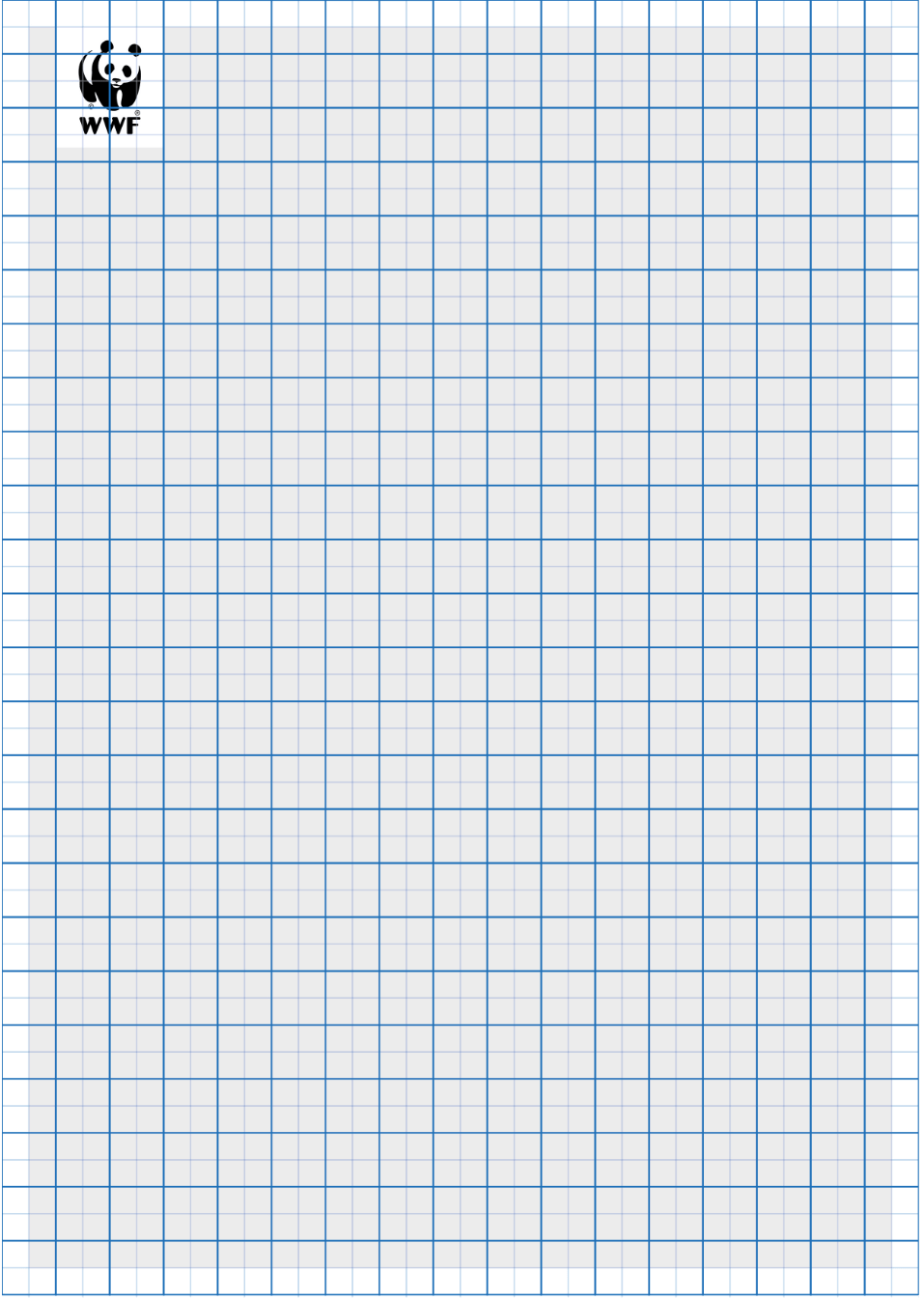
THE LOGO GRID SYSTEM
The WWF Logo has been designed specifically to work on a robust grid system. We introduce consistency by using the grid system for the following:
- Sizing and positioning of the WWF Logo
- Positioning typography
- Sizing and positioning of graphic devices
- Organizing layouts or interfaces
- Establishing hierarchy in compositions
On this page is an example of a 34 x 48 grid, which is formatted to work on ‘A-sized’ documents (A4, A5, etc.).
For added adaptability, we recommend that you ensure three sides of the WWF Logo sit on the grid. This can be any three sides of the logo.
Templates and further guidance are available on the Publication Guidelines page.
COUNTRY OR PRACTICE IDENTIFIER
We are one global network tackling global issues, this is why we always prefer the “One network” approach and simply recommend using the WWF logo in our communications. A ‘Country’ or ‘Practice’ identifier can be used on specific reports only with the name of a WWF country office or one of the nine Practices. An identifier cannot be used with the WWF logo for internal or external campaigns, initiatives or programmes. When using a ‘Country’ or ‘Practice’ identifier, the name of the country or Practice sits underneath the WWF Logo, separated by a 1pt divider line.
Templates and further guidance is available on the Publication Guidelines page.
WWF NAME
For communications purposes, WWF is always written with its three-letter acronym: WWF.
With the exception of legal documents, we never spell out our name as “World Wide Fund for Nature” or any other national version. If you are pressed to write more than “WWF”, you can qualify this by adding “the global conservation organization”, to read: “WWF, the global conservation organization”.
With the exception of legal documents, we never spell out our name as “World Wide Fund for Nature” or any other national version. If you are pressed to write more than “WWF”, you can qualify this by adding “the global conservation organization”, to read: “WWF, the global conservation organization”.
Legal:
The exception to the above is legal and formal documents. Whenever you are preparing a formal legal document you must use the full legally registered name of the entity you are referring to e.g. for WWF International this is: “WWF-World Wide Fund for Nature (formerly World Wildlife Fund)”. Other National Organizations have their own separate legal names. Please check with your legal team.
The exception to the above is legal and formal documents. Whenever you are preparing a formal legal document you must use the full legally registered name of the entity you are referring to e.g. for WWF International this is: “WWF-World Wide Fund for Nature (formerly World Wildlife Fund)”. Other National Organizations have their own separate legal names. Please check with your legal team.
WWF office names:
WWF International is written without a hyphen, but all other WWF offices, National Organizations (NOs) and Programme Offices (POs), should be hyphenated: WWF-US, WWF-China, WWF-North Africa, WWF-India.
WWF International is written without a hyphen, but all other WWF offices, National Organizations (NOs) and Programme Offices (POs), should be hyphenated: WWF-US, WWF-China, WWF-North Africa, WWF-India.

© Florian Hänggeli / WWF-Switzerland
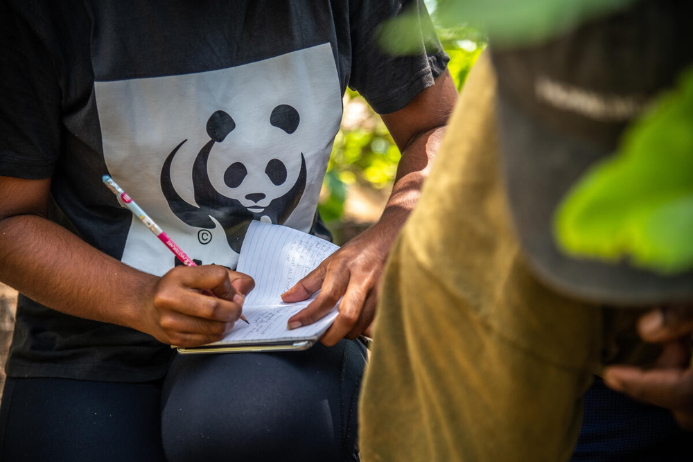
© WWF-Pacific/Tom Vierus
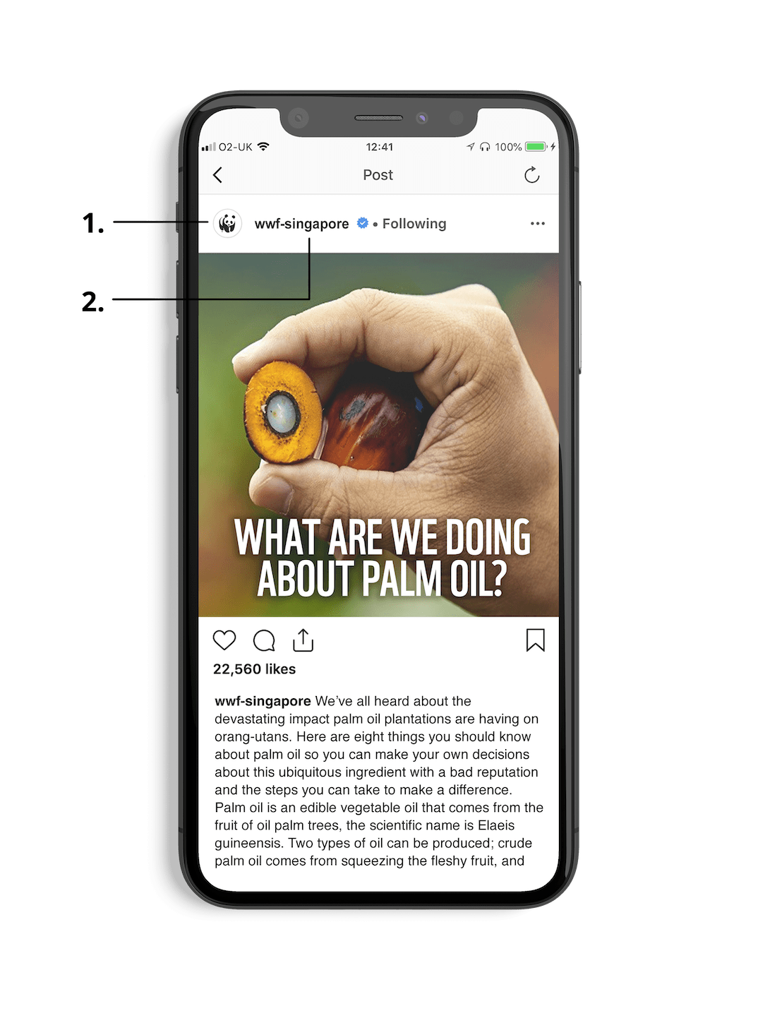
SOCIAL & ON-SCREEN
1. WWF PANDA ICON
In online usages, the WWF Logo does not need to be used. The Panda Icon (without the WWF initials) can be used as long as the account handle features ‘WWF’ in its name.
2. COUNTRY IDENTIFIER
In many cases, the country is identified by the name of the account, so a country identifier is not needed.
Templates, guidance and assets will be provided for all digital sizes in the coming months.
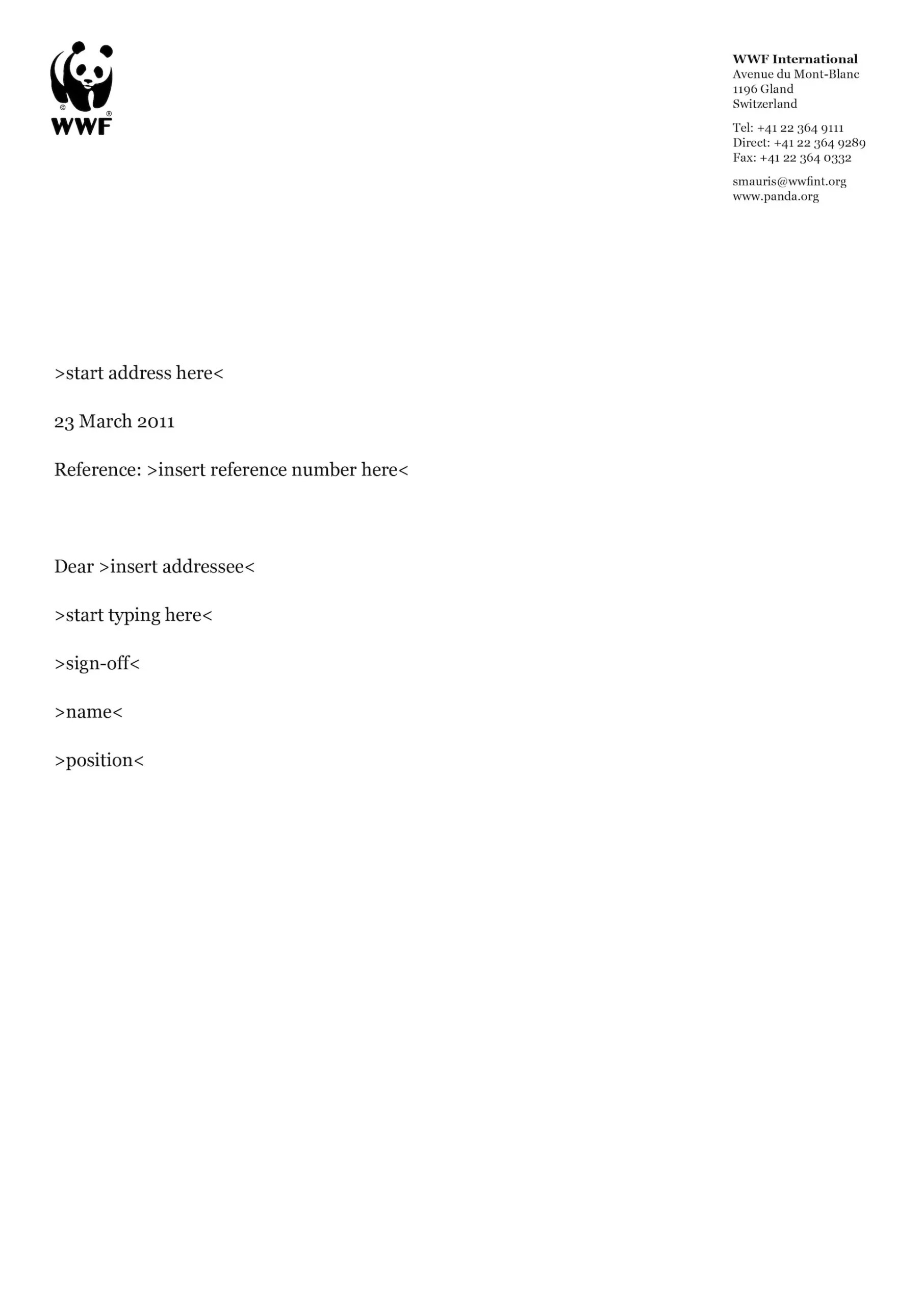
USING THE LOGO ON A WHITE OR LIGHT BACKGROUND
The rules of the logo do not change on a white or light background. The clearance space and use of a grid underlines the layout and usage of the logo.
It is not a requirement to highlight or emphasize the containment box shape. A keyline should not be added.
Downloadable templates are available on the Assets page.
