PUBLICATION GUIDELINES
© Michel Gunther / WWF
Producing consistent, powerful publications.
These guidelines are the key principles to make our publications clear and visually impactful to our audiences. It is important that they are followed in order to deliver our brand expression consistently, and that the tone of voice guidelines (bold, clear and human) are applied in terms of content.
The guidelines do allow for different formats to be applied, depending on the audience and publication purpose. So, for example, a globally significant publication such as the Living Planet Report should be in a format that ensures it has a long shelf life.
Templates are available to download as a starting point for your publication.
USING THE TEMPLATES
Templates are supplied as Indesign CC 2019 files. There are also IDML versions for users with older versions, but we suggest using the latest version where possible.
The templates contain master pages covering internal layouts, and front and back covers.
There are also the WWF Swatches and typography style sheets are also included.
PUBLICATION GUIDELINES
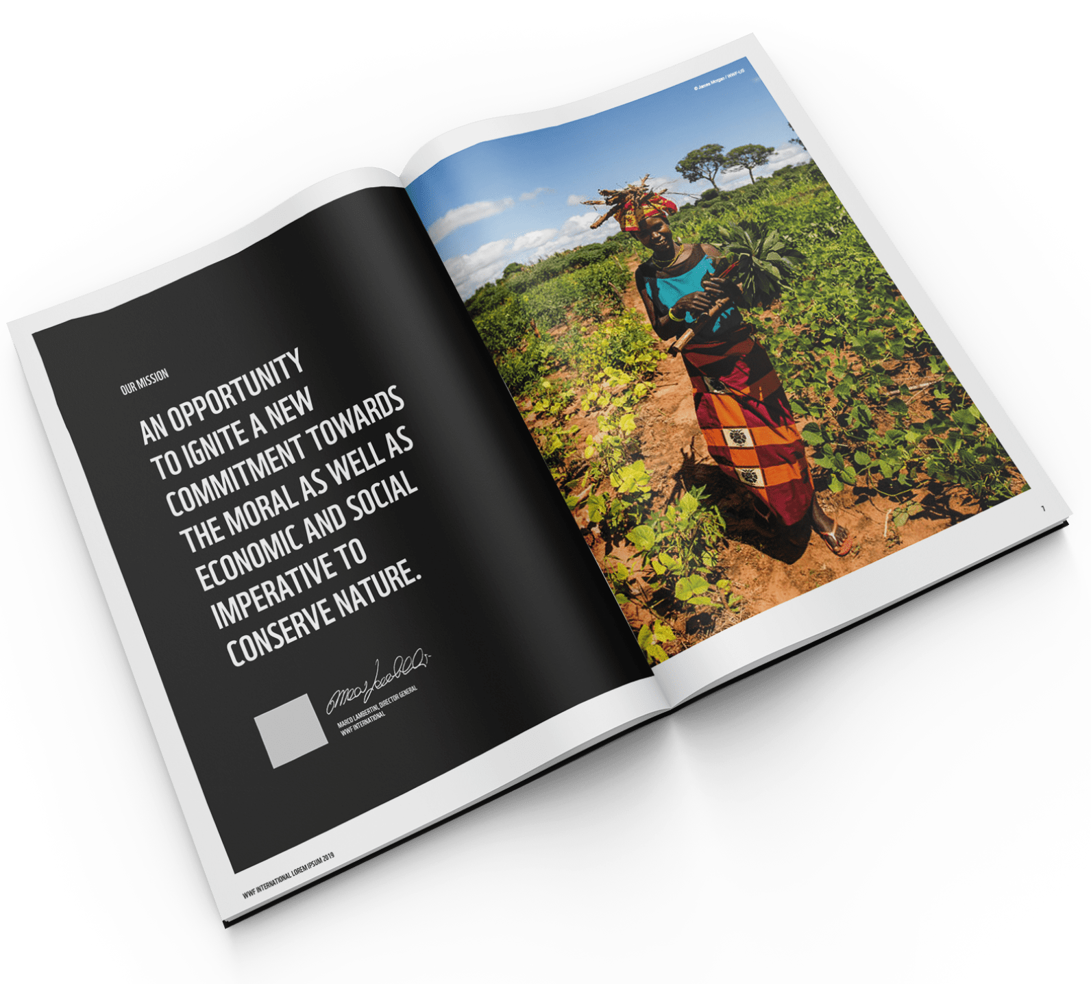
A supporting PDF is included in the template download folder, which gives details and guidance on the templates.
If you require more guidance or have any requests please contact commsmarketing@wwfint.org
FRONT COVERS
WWF Publication front covers are designed using the WWF Grid System. You can see more about the grid on the logo page.
Front covers include a strong image, white border, WWF logo and content box.
The front cover may also include the country or practice identifier, if needed.
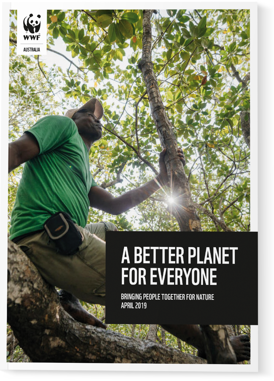
FRONT COVER
ITEMS AND THE GRID
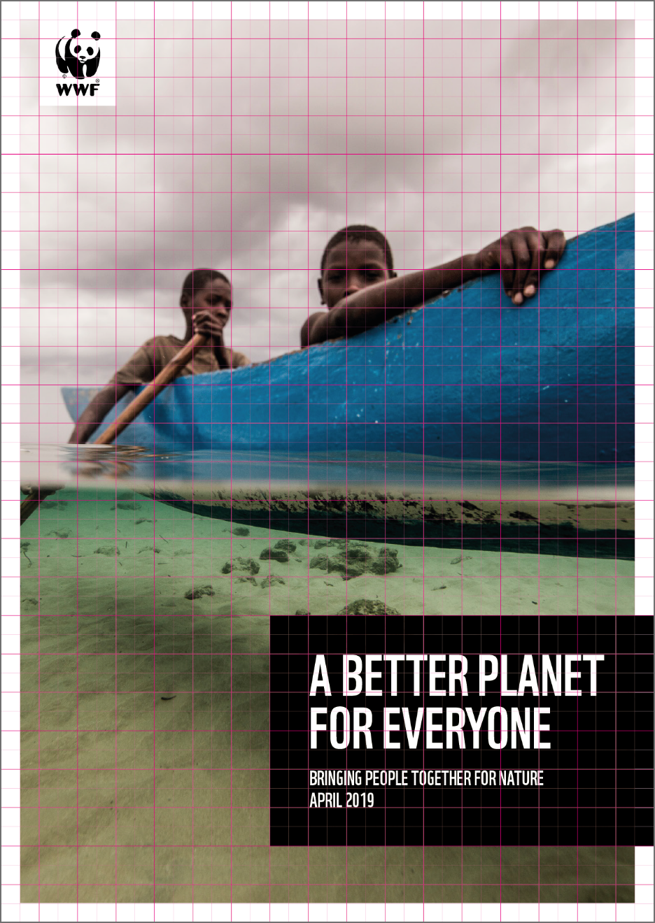
This page shows an example of a 34 x 48 grid, which is formatted to work on ‘A-sized’ documents (A4, A5, etc.).
The WWF logo, content box and border all sit on the grid.
You can find out more about the grid and logo usage on the logo page.
EVOLUTION FROM THE VALUE TAB
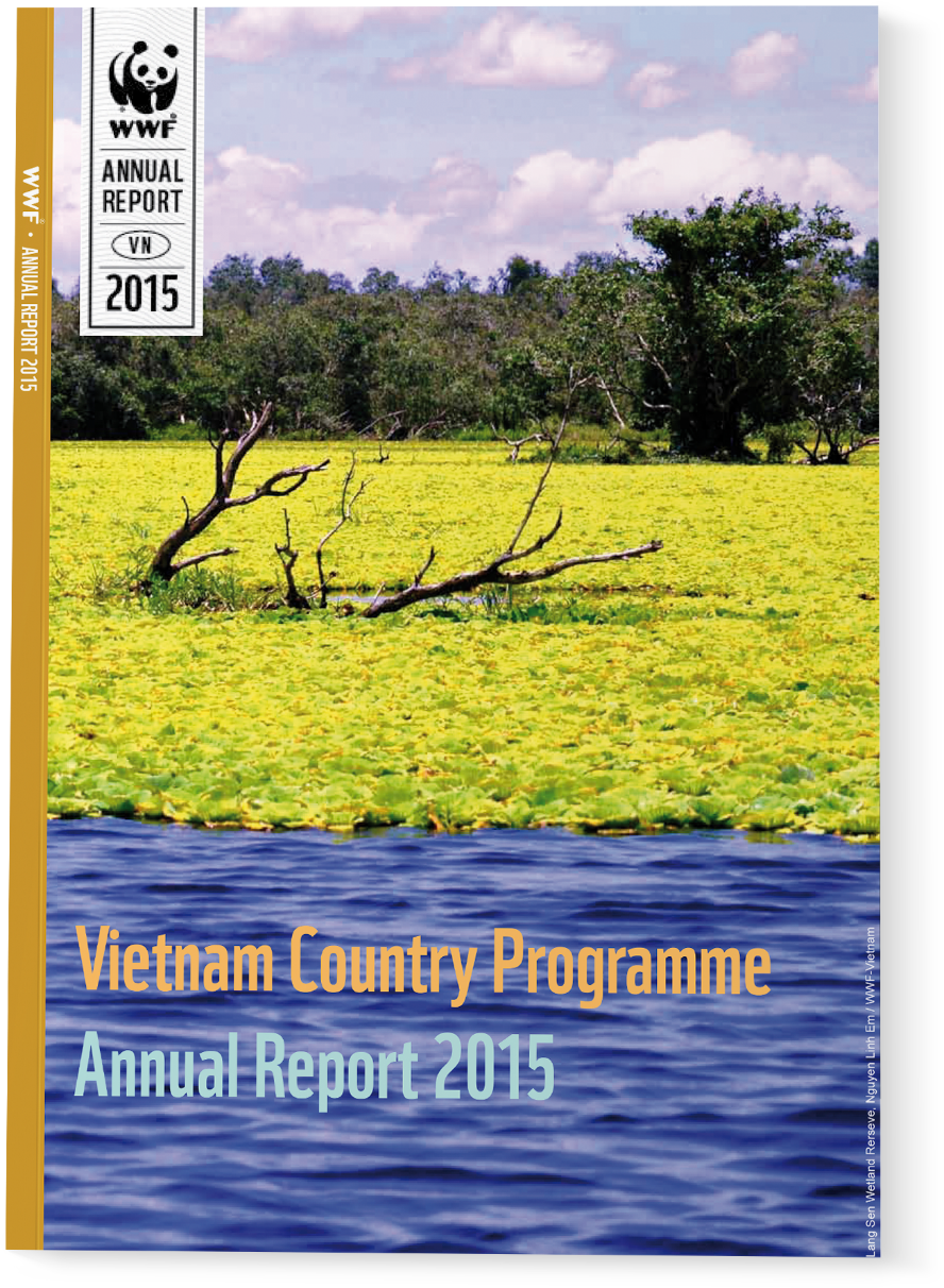
PREVIOUS VERSION
As you can see with the current Logo Tab version, there is a lot of repeated information. ‘Annual Report’, ‘Vietnam’ and ‘2015’ is repeated at least once, elsewhere on the cover.
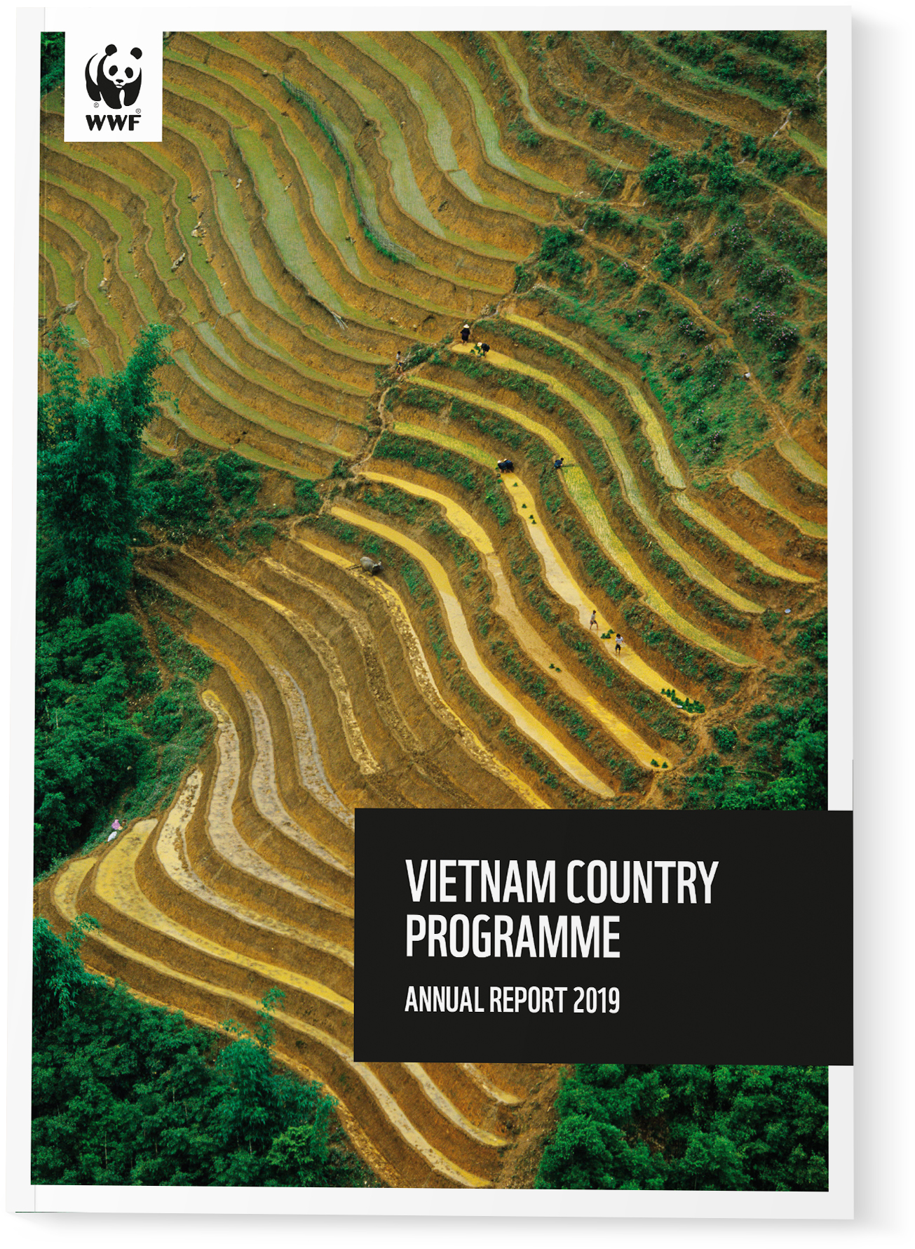
UPDATED VERSION
By removing the duplicate information we are able to reduce the amount of items around the logo, allowing clear space to communicate. When relevant, only the country or practice identifier are allowed under the logo.
INSIDE SPREADS
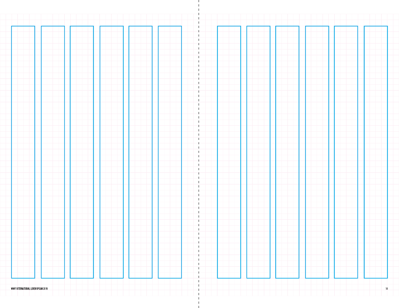
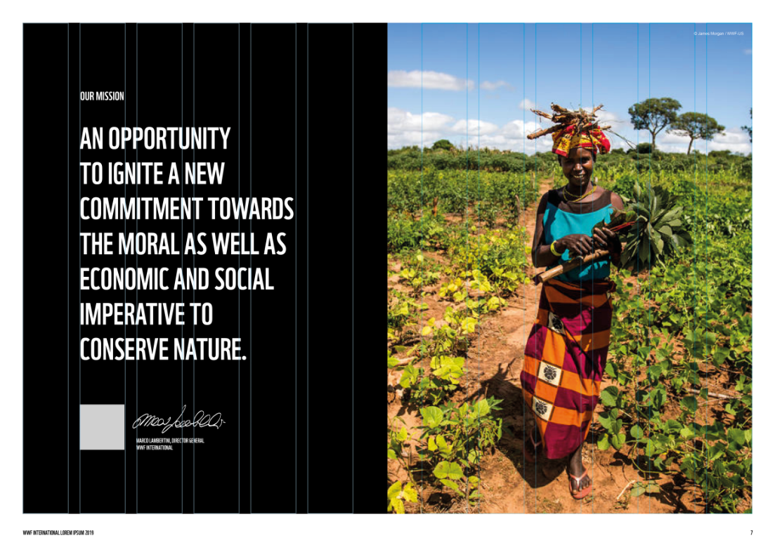
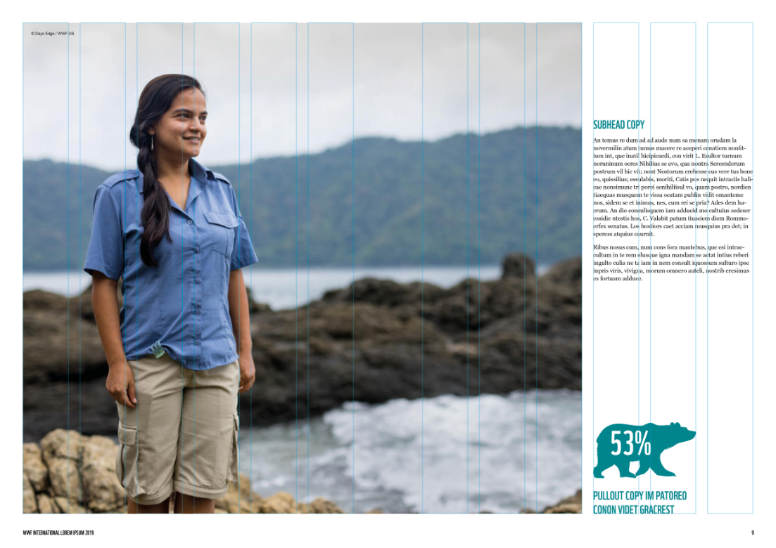
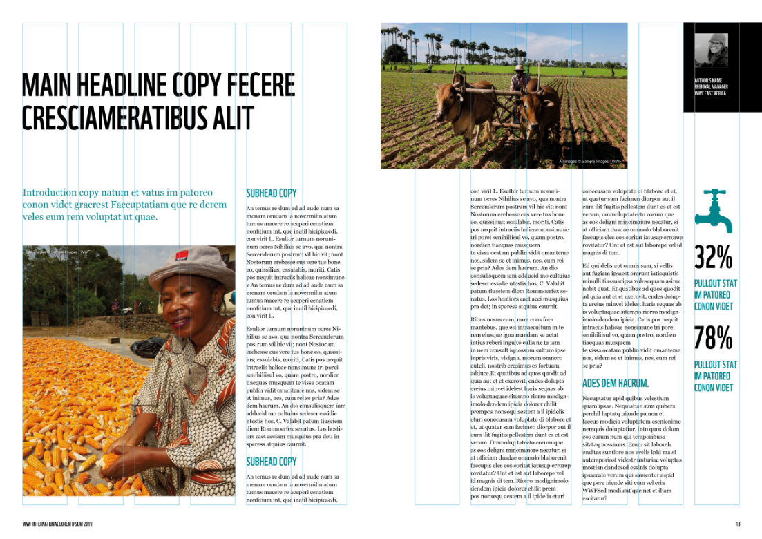
Inside spread pages are created using a 6 column grid. There are various page layouts included in the template, but feel free to use them as a basis for creating your own.
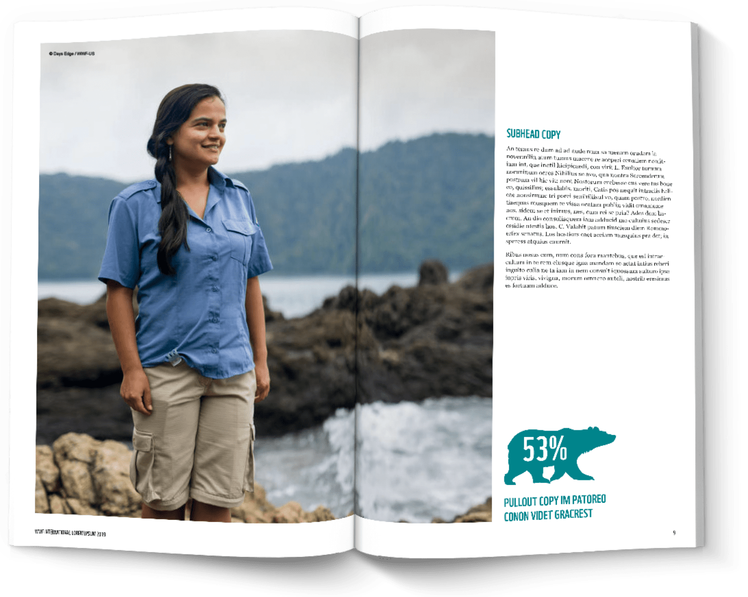
THE 6 COLUMN GRID
We have used the WWF Grid System to create the Publication Guidelines internal page structure.
The WWF Grid System is also available to use, but we feel the column structure will offer enough layout options for most users.
Folios and footers sit outside the 6 column layout.
TYPOGRAPHY
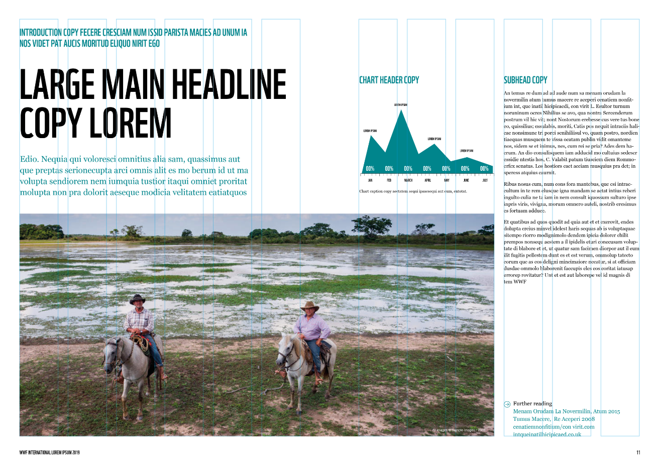
Paragraph styles are set up in the templates, but here are the basic typography rules:
Heading: WWF Font with sizing options 51/52pt*, 38/39pt, 30/31pt
Standfirst: Georgia Regular 15/20pt
Subhead: WWF Font 18/22pt
Body copy: Georgia Regular 9/12pt
Photo captions: Arial Regular 9pt
You can find more information about WWF Typography
IMAGERY
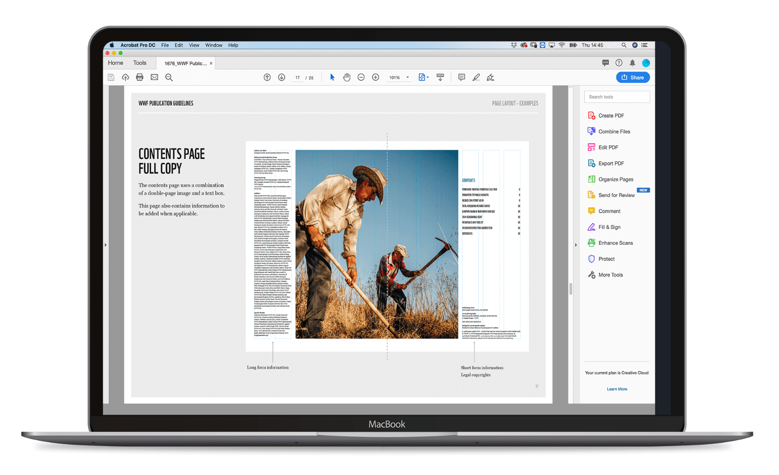
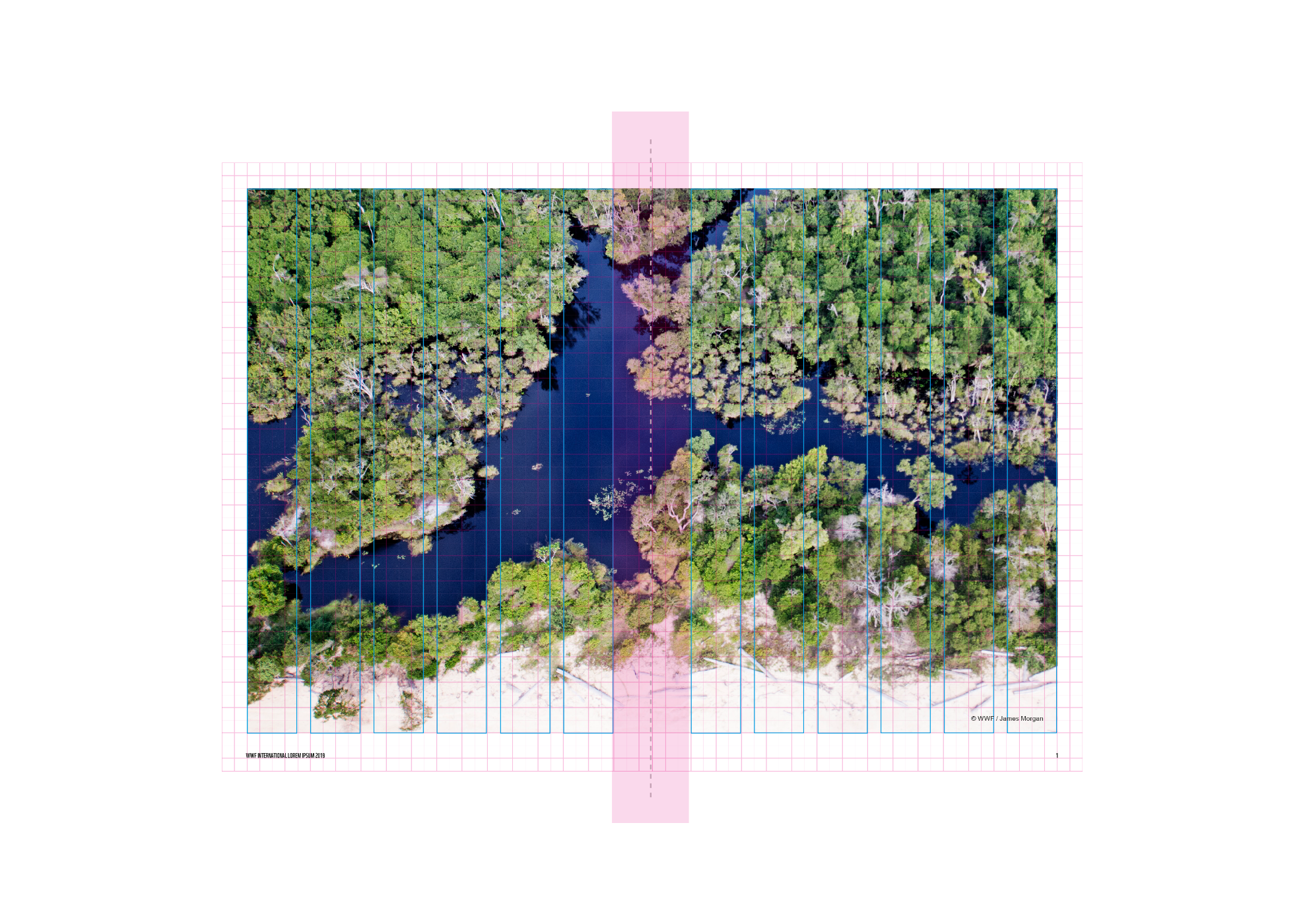
Images can be used across a double page spread to create an impactful layout. They must stick to the 6 column grid and include the white border.
Try to avoid placing faces or key areas of an image across the middle fold of the page as, once printed, the photo’s impact will be lost.
PAGE LAYOUT EXAMPLES

BACK COVERS
WWF Publication Back Covers are designed using the WWF Grid System. You can see more about the grid on the logo page.
Back covers are more adaptable than front covers and can include images, statements, a combination of the two, or left plain.
Back covers must include the Boilerplate Badge and Legal Information.
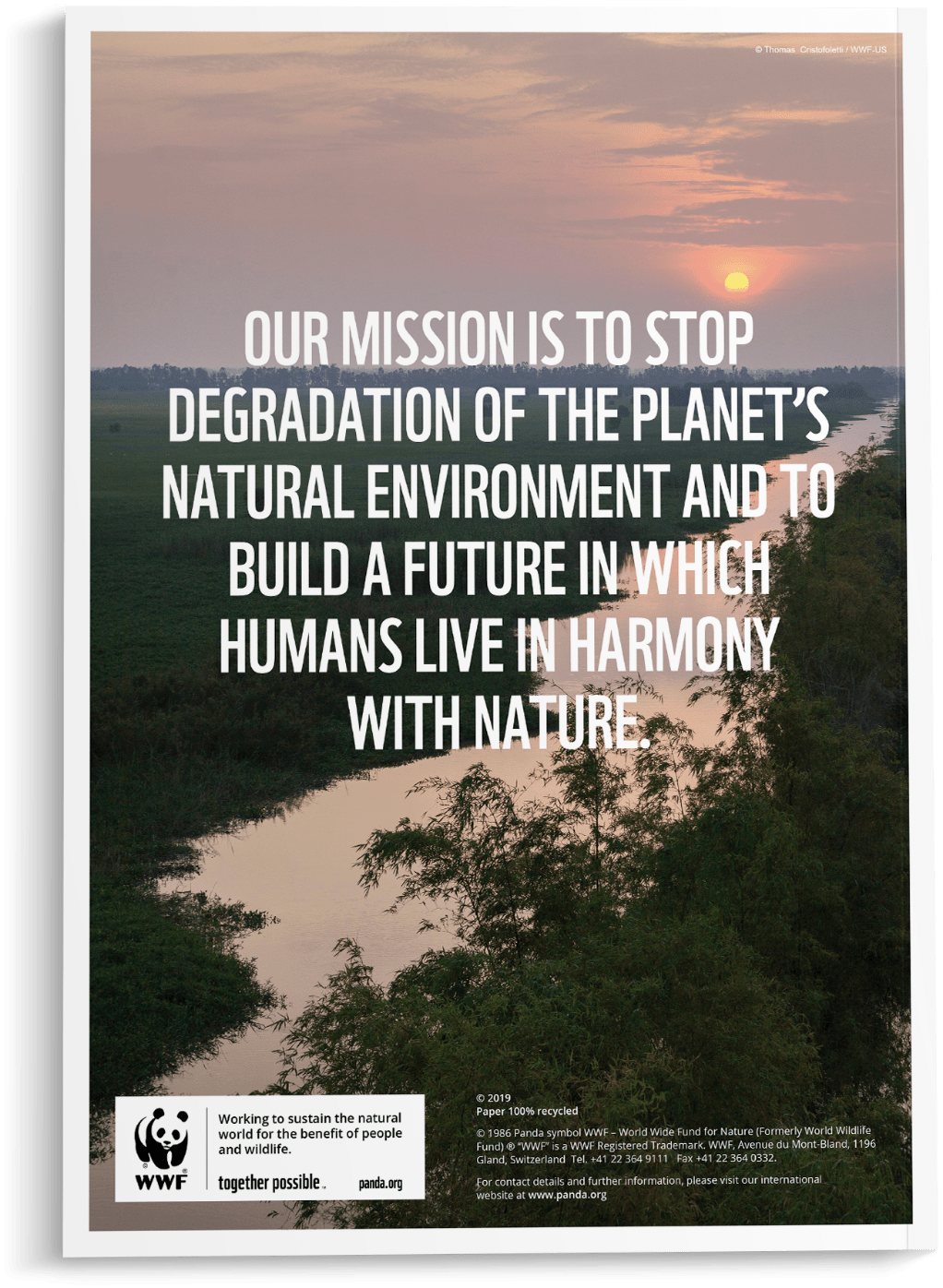
BACK COVER
ITEMS ON THE GRID
The back cover also uses the 34 x 48 grid.
All items sit on the grid. The layout of the back covers is open to more layout adjustment than front covers. Back covers can include images, statements and colour blocks, or can be left plain, depending on the requirements of the document.
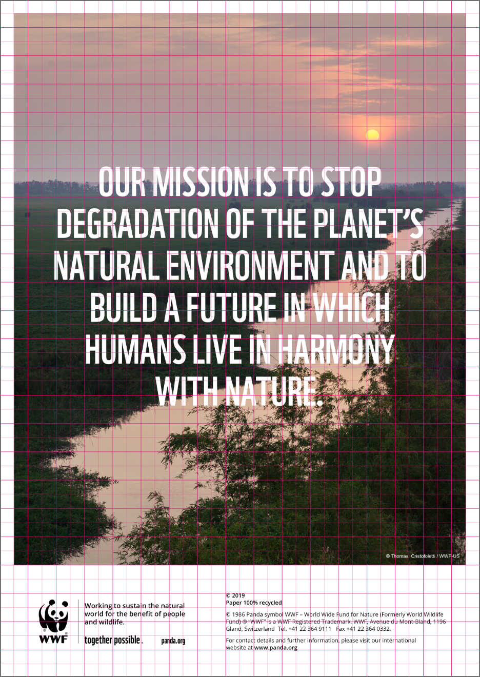
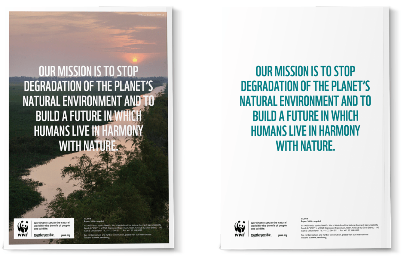
BACK COVER EXAMPLES
The back cover is open to be used for multiple purposes, depending on the document. On this page we show examples of a full page image, statement only or image block version.
When using an image, you must ensure that the legal copy is legible.
BOILERPLATE BADGE
The Boilerplate Badge is a single downloadable asset that works on the A5, A4, A3 and B5 sizes.
The Boilerplate Badge contains all the mandatory elements: the WWF logo, mission statement, ‘together possible’ ethos and web address. The Boilerplate badge content can be localized.
It is set in place in the InDesign template but if you need to use it independently or localize it, you can download the editable standalone asset.
