WORKING WITH PARTNERS TO ACHIEVE OUR GOALS
IMPORTANT: Please note that these partnership guidelines will be revised shortly in light of an upcoming EU directive with implications beyond Europe. If you are planning any joint communications with partners that have a commercial effect in the EU, please consult the WWF Global Corporate Engagement SharePoint Site for further information and guidance.
To avoid any confusion or misrepresentation, we must be clear about why and how we are working within any type of partnership, including with businesses, donors and public sector bodies.
The purpose of these guidelines is to outline our brand requirements for internal and external partnership communications – all within the context of ‘together possible’, our organizational commitment to working collaboratively with others.
While partnerships teams are expected to follow these guidelines, we appreciate that some flexibility may be required in particular circumstances. Nevertheless, it is important that the following principles are always adhered to: we communicate clearly why we’re working in partnership, and we use the WWF logo correctly.
IMPORTANT NOTES:
Note that the use of our logo and name by third parties is always subject to agreement. Make sure you contact the relevant team – corporate , public sector or fundraising – when discussing partnerships and ahead of using these brand partnership guidelines.
IN ‘OUR WORLD’
IN THE ‘SHARED WORLD’
IN ‘THEIR WORLD’
CORE ELEMENTS OF PARTNERSHIP COMMUNICATIONS
- The partnership statement
- The partner logos
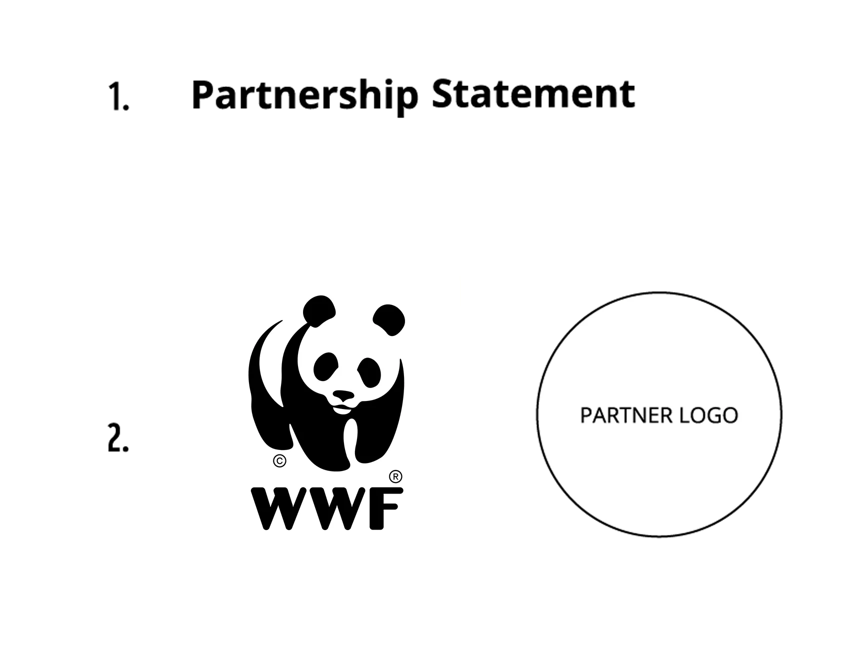
1. PARTNERSHIP STATEMENT
THE PARTNERSHIP STATEMENT: PROVIDING CONTEXT
Our mission is complex and our partners wide ranging, which could lead to possible misunderstandings among audiences.
So when WWF works with a third party – whether we lead the communications or not – we must therefore clearly explain to our many audiences WHY we have formed this partnership.
FOR EXAMPLE:
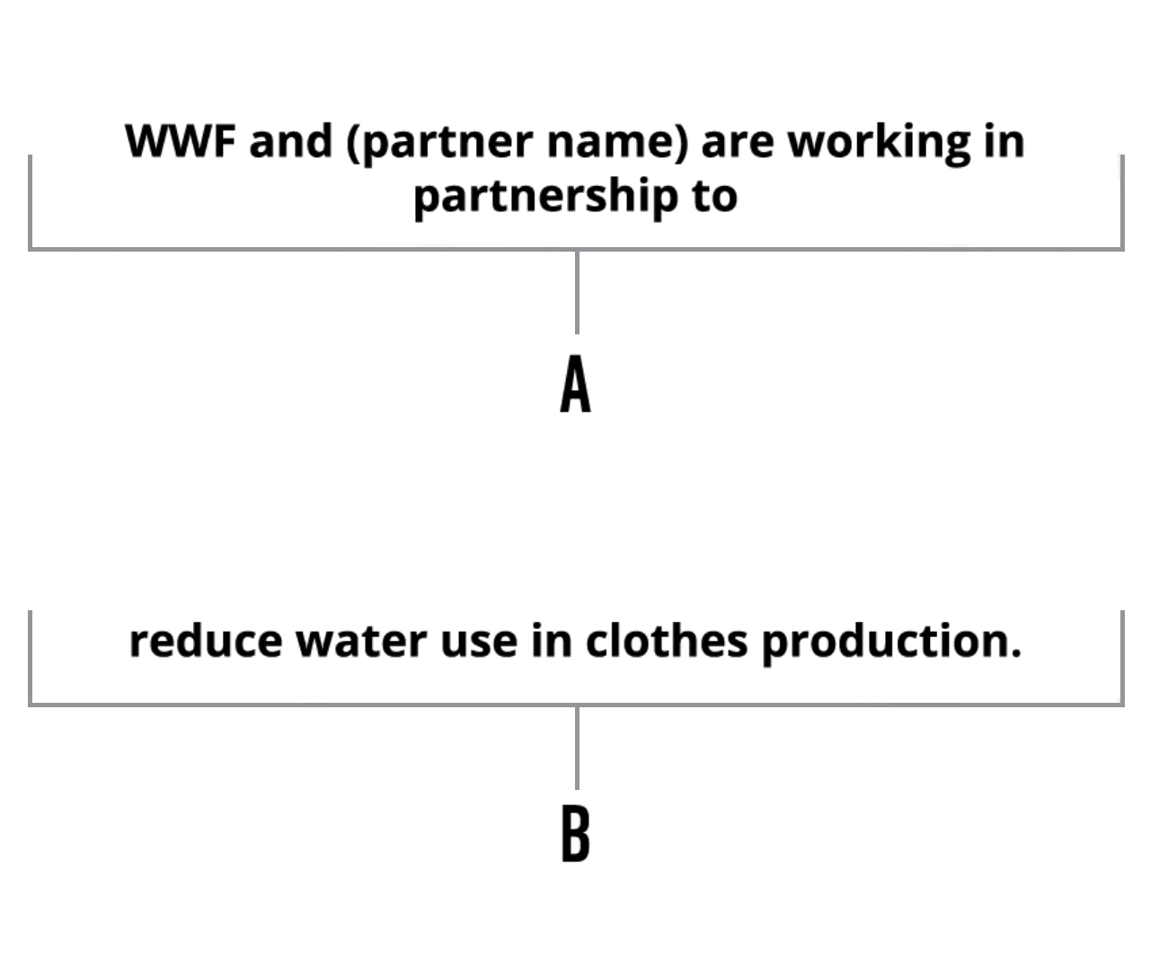
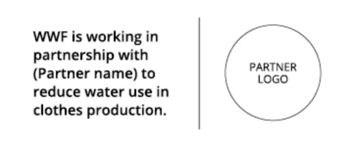
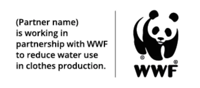
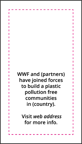
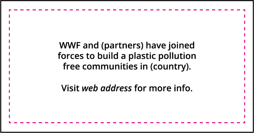
WWF and (partner name) are working in partnership to reduce water use in clothes production.
THE PARTNERSHIP STATEMENT: STRUCTURE
The partnership statement needs to clearly and concisely represent the partnership aims.
The statement is structured into the following way, split into two sections A and B.
Part A outlines who are members of the partnership. We recommend to word part A as shown in the example. Using the words ‘working in partnership’ (or similar, for example ‘working together‘) ads a sense of clarity which is of utmost importance for the audience.
Part B outlines the partnership objective(s). Part B should contain sufficient detail to contextualize the partnership for audiences while remaining as concise as possible. Always ensure the statement includes a full stop, when used inside and outside of the partnership badge.
Exact phrasing should be agreed at the contract stage.
THE PARTNERSHIP STATEMENT: TYPOGRAPHY


2. PARTNERSHIP LOGOS
LOGO USAGE WITH ONE PARTNER
The logos of partners are used to illustrate and support the partnership statement.
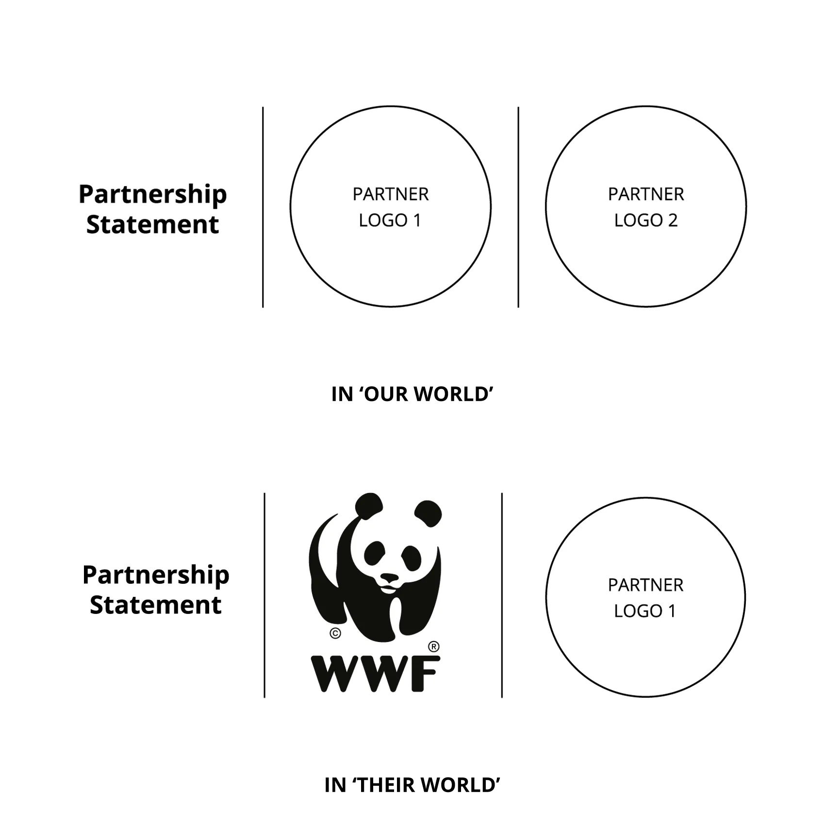
When used, we recommend the order of the logos should reflect the partnership statement.
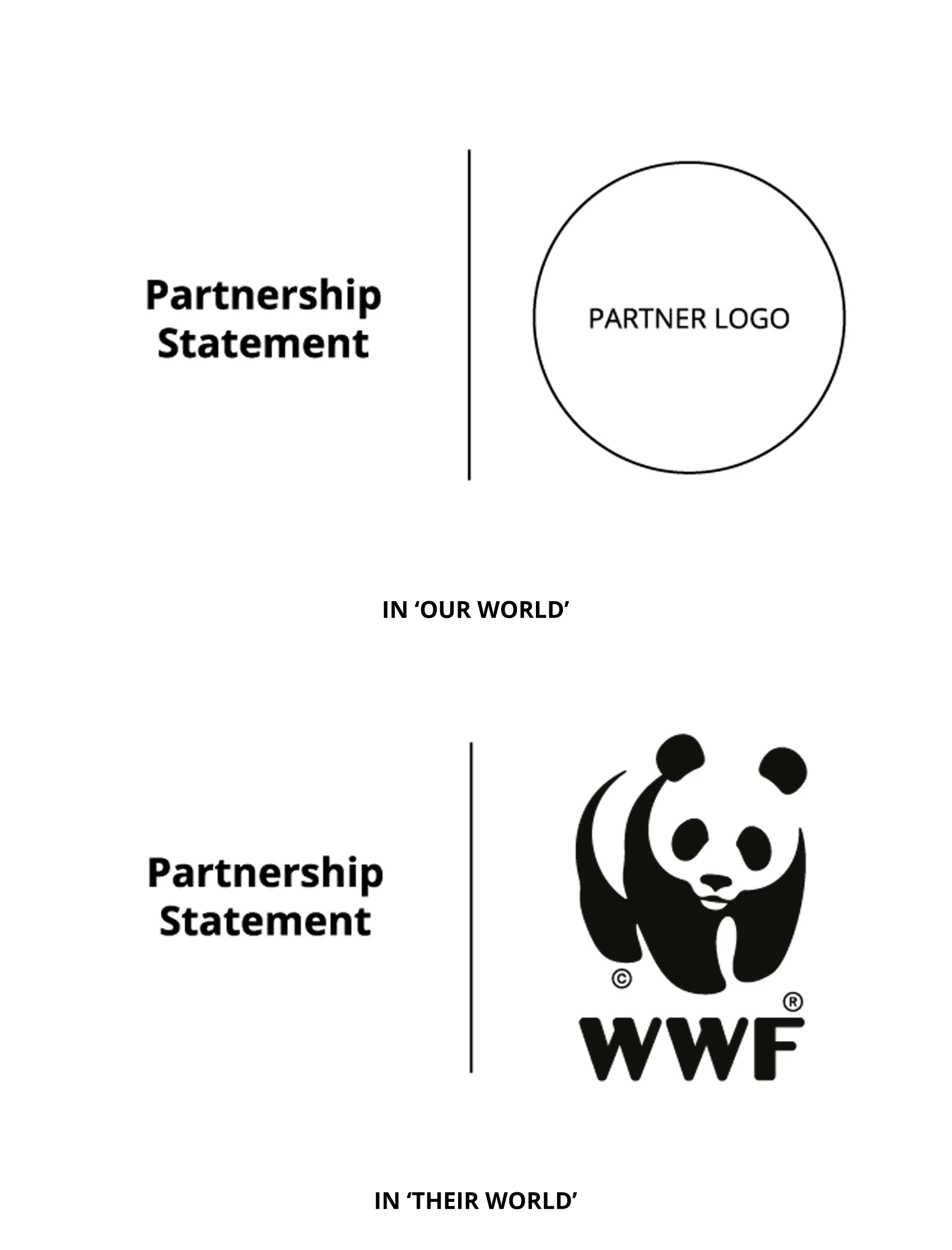
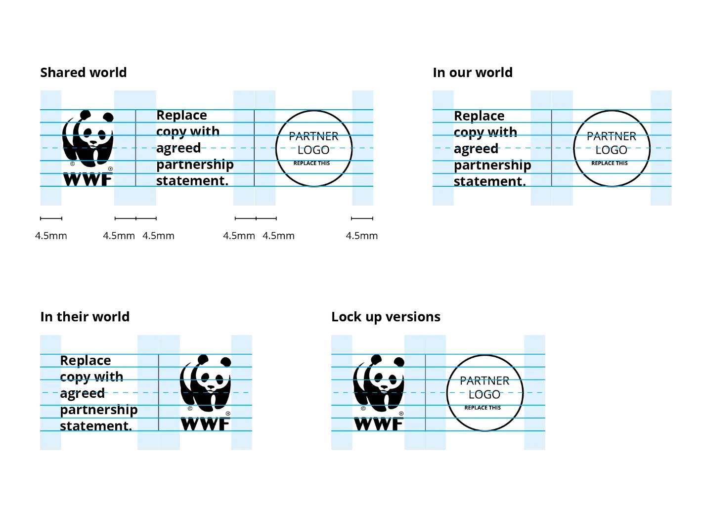
In ‘our world’, WWF should appear first; in ‘their world’, WWF should appear second; and in the ‘shared world’, assets creation should be discussed between stakeholders.
Our preference is for logos to be included. However, we appreciate that this may not be possible in all situations. So if space is restricted, only the partnership statement (providing context) continues to be the mandatory element.
More information on logo usage is available on the Partnership Guidelines PDF.
LOGO USAGE WITH MULTIPLE PARTNERS
When there are multiple partners, the same basic rules apply.
In ‘our world’, WWF should come first in the list. This is followed by other partnership logos, which should normally appear in alphabetical order. However, this approach may not be possible where one partner has a particularly strong contribution or where the partnership agreement requires a particular partnership listing.
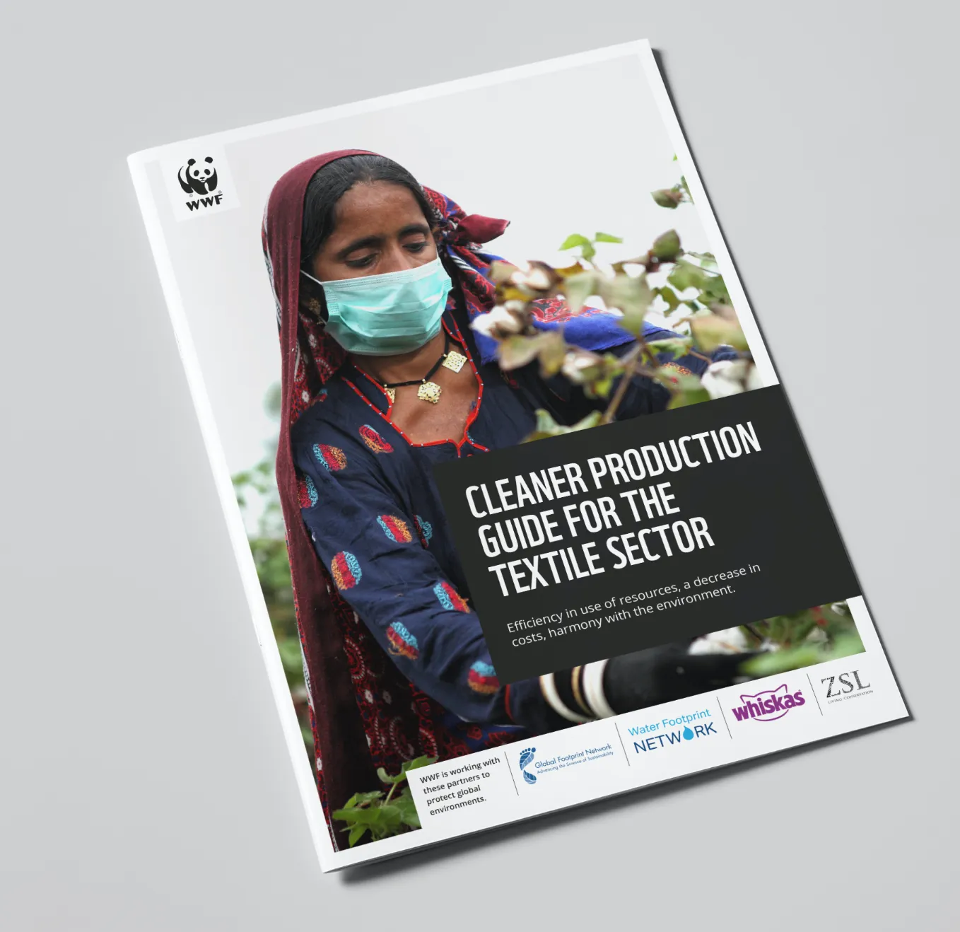
For the sake of clarity, we recommend that the main partners always appear on the cover page of a communication. Supporting partners can be mentioned, along with their logos, on the inner pages.
CONSTRUCTION AND LAYOUT
© WWF / Jean-Luc Ray
PLACEMENT OF PARTNERSHIP STATEMENT AND LOGO
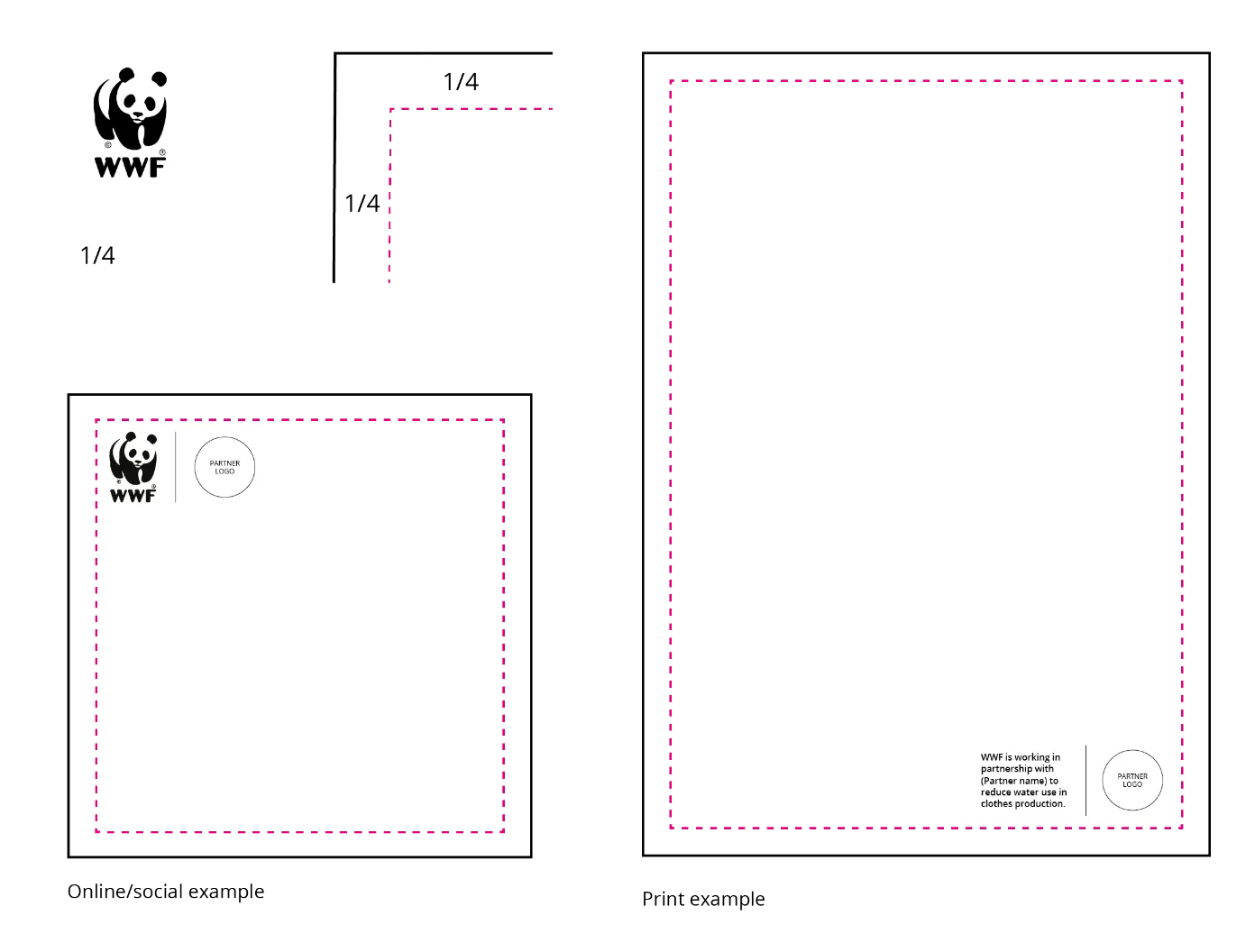
The guidelines allow for flexibility about where the partnership statement and logos are placed in communication assets. The key thing is to ensure that the partnership statement is highly visible to audiences so they can see the context for any partnership arrangement.
In most normal circumstances, we would recommend the following approaches:
the WWF logo will already appear on our communication. So ensure there is no duplication of WWF logos to prevent unnecessary repetition.
assets creation should be discussed between stakeholders. The only mandatory element is the partnership statement.
ensure that the partner logo only appears once to avoid duplication.
IN ‘OUR WORLD’
IN THE ‘SHARED WORLD’

IN ‘THEIR WORLD’
CREATING BALANCED LAYOUTS – HORIZONTAL GUIDELINES
IN ‘OUR WORLD’
IN THE ‘SHARED WORLD’
IN ‘OUR WORLD’
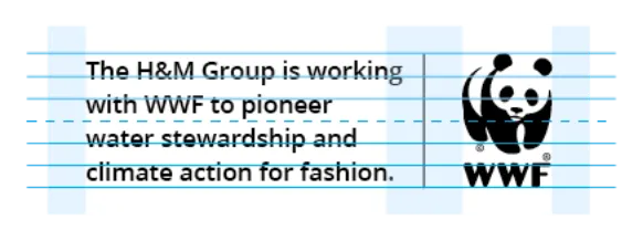
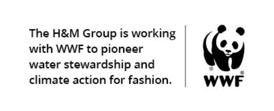


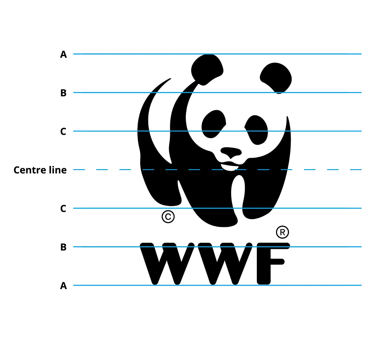
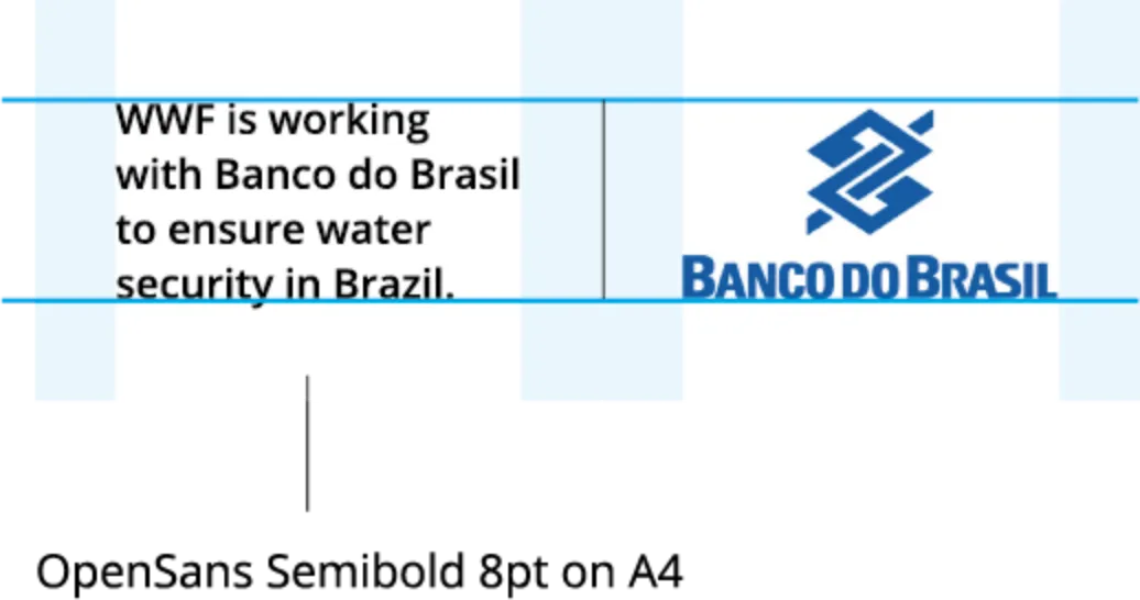
The partnership statement must be left aligned and set at 8pt on 10 leading. The copy does not need to sit on the A, B and C logo guides, but does need to be centred vertically.
Complete information on how to create balanced layouts is supplied in the downloadable assets folder.
CREATING BALANCED LAYOUTS – VERTICAL DIVIDERS
FLEXIBLE PLACEMENT
LAYOUT EXAMPLES
PRINT EXAMPLES
In ‘our world’ example – reduces dual panda logo
In ‘their world’ example
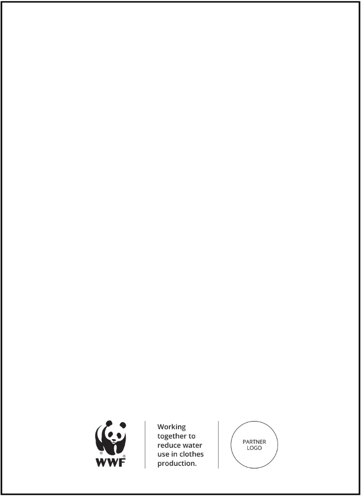
‘Shared world’ example
ONLINE AND SOCIAL EXAMPLES
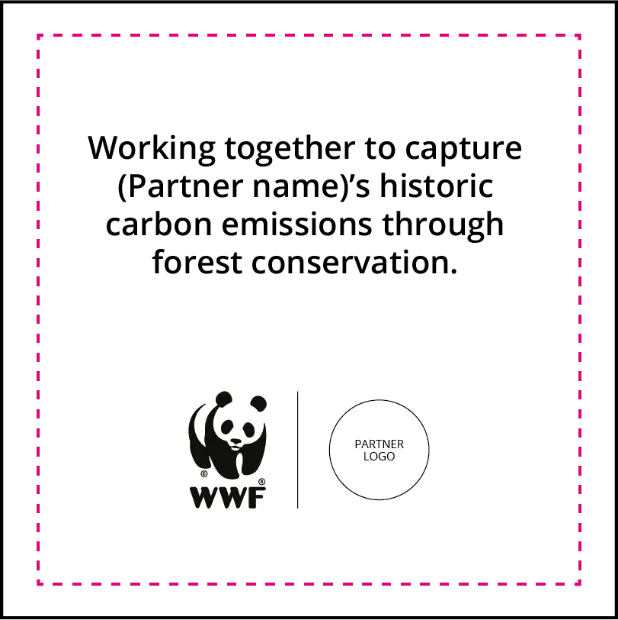
PARTNERSHIP COMMUNICATION IN ACTION
PUBLICATION EXAMPLE: MULTIPLE PARTNERS IN ‘OUR WORLD’
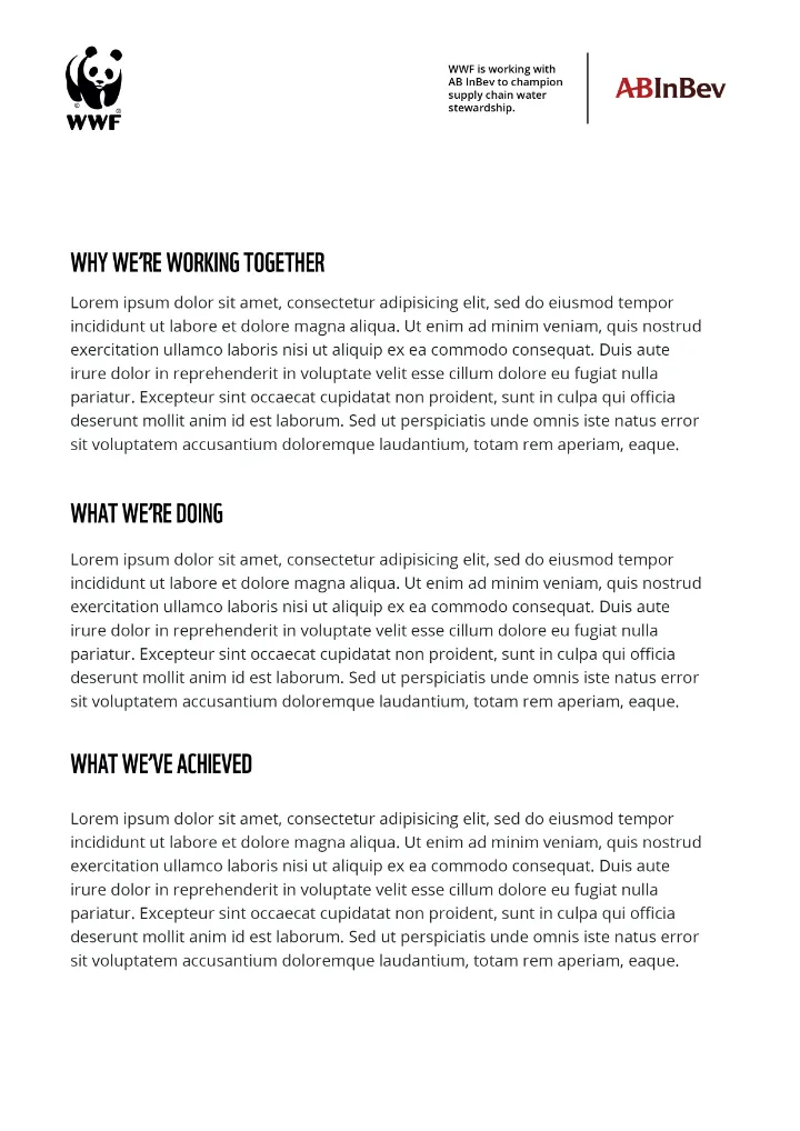
USAGE ON WHITE: IN ‘OUR WORLD’
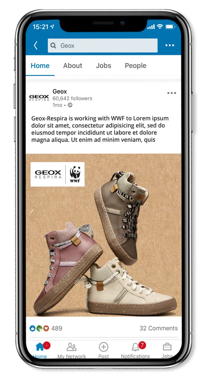
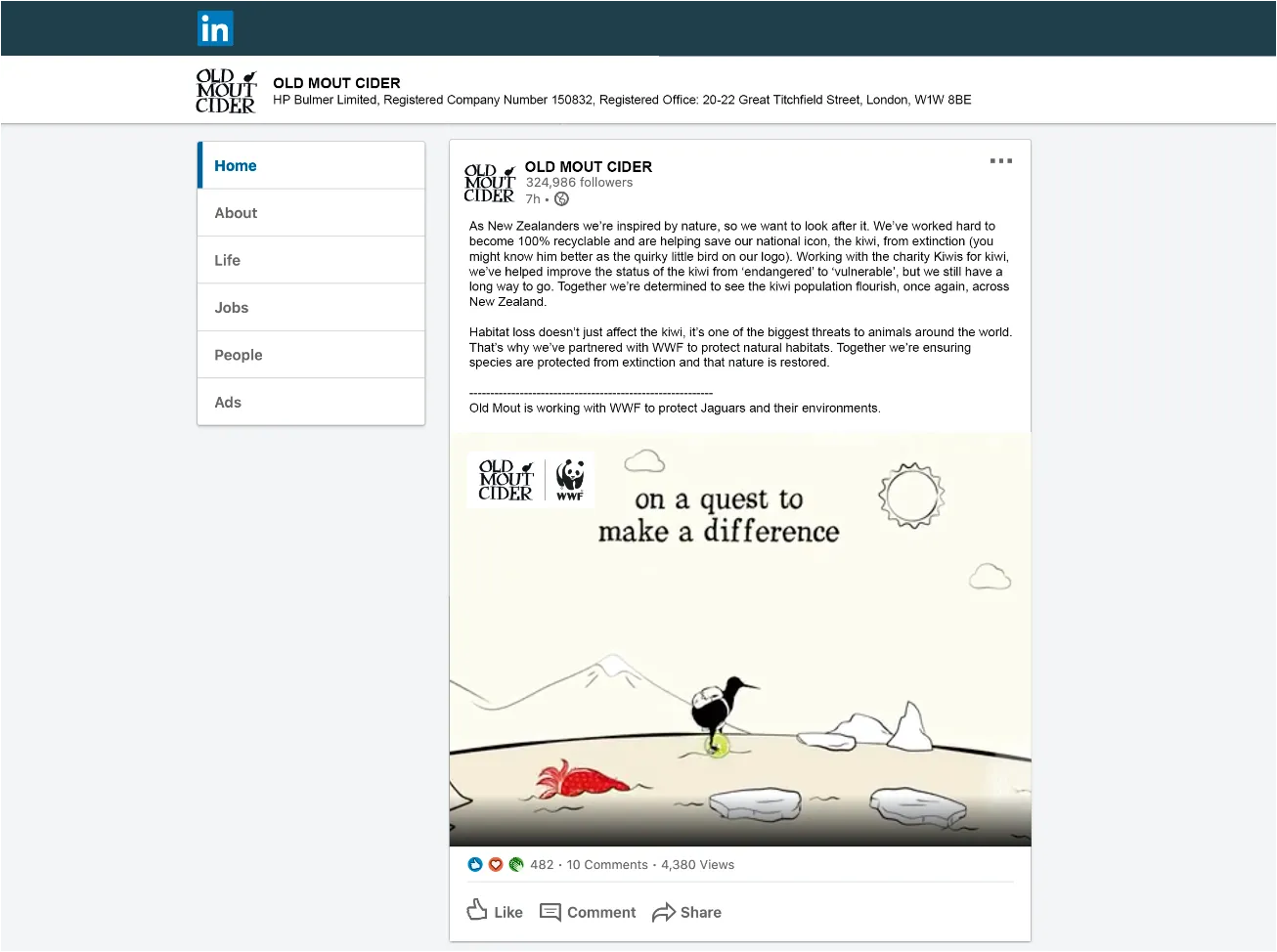
SOCIAL MEDIA & VIDEO: IN ‘THEIR WORLD’
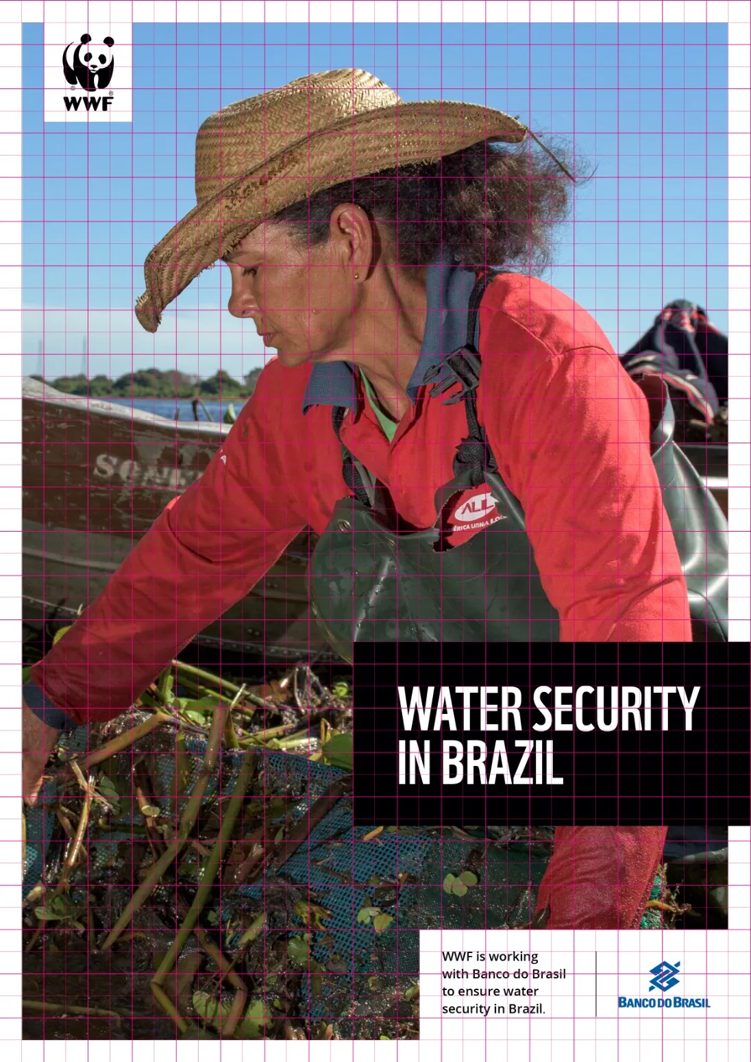
PUBLICATION EXAMPLE: IN ‘OUR WORLD’
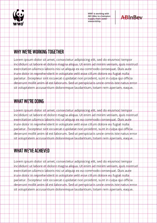
All of the elements sit on the WWF Grid. The partnership badge can be created in programs such as InDesign or Illustrator.
More information on the grid usage in the publication page and logo page.
SOCIAL MEDIA & VIDEO: IN ‘OUR WORLD’
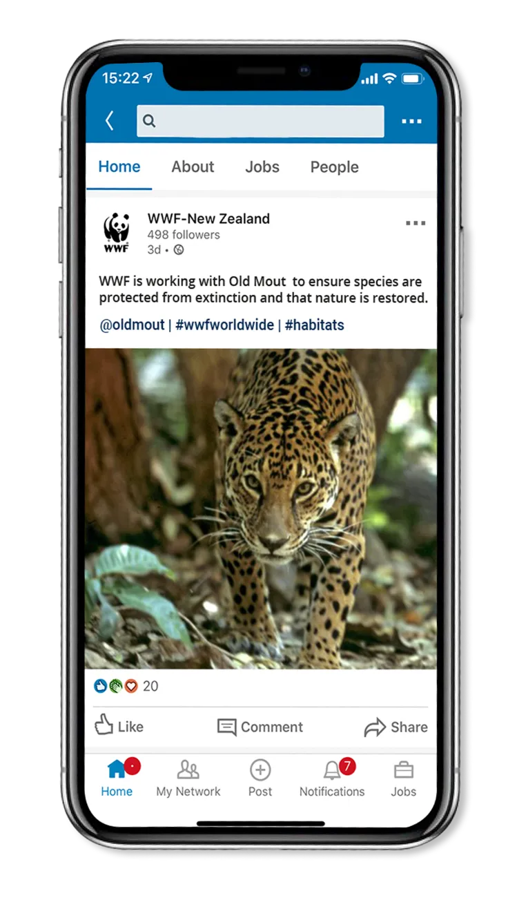
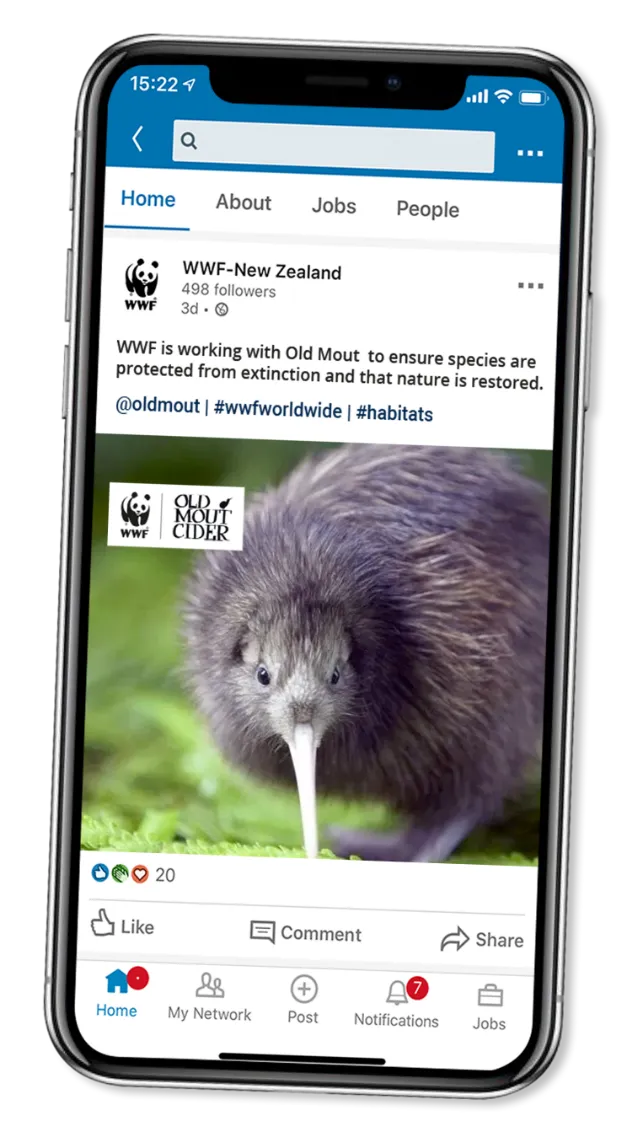
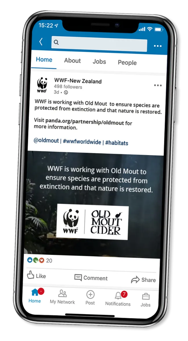
SOCIAL MEDIA & VIDEO: IN ‘OUR WORLD’
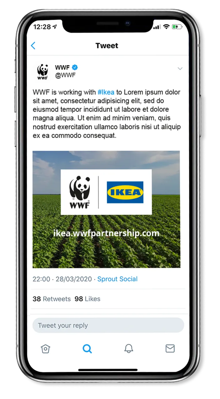
SOCIAL/VIDEO: IN ‘THEIR WORLD’
As a conservation organization dedicated to creating deep impact for people and nature directly on the ground, WWF also works with countries and communities to support National Parks and Conservation Areas in the field. Visit this page for more information on visual guidelines for on-the-ground partnerships.
